Release highlights October
This blog post covers some highlights from the latest releases of GDS.
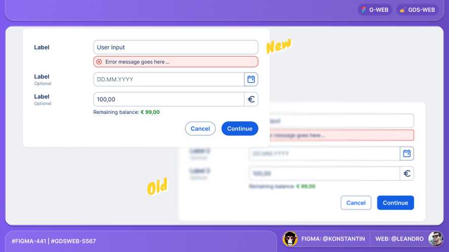
Rounded UI update
We refined corner radii across the entire design system to create a more cohesive, modern, and visually consistent interface. This change, which is streamlining with the George mobile apps, will positively impact webviews which make use GDS, for example local flows.
The corner radii for Buttons has been updated from 8px (or 6px with small buttons) to fully rounded, whereas the corner radii for Cards, Inputs etc. have been adjusted from 8px to 12px to maintain optimal usability and aesthetics.
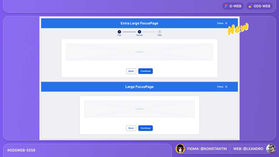
Focus page: Size update
FocusPage got a size update to provide greater flexibility and improved usability across different screen sizes and content densities. The four available sizes are now small, medium, large, and extra-large.
Figma plugin update
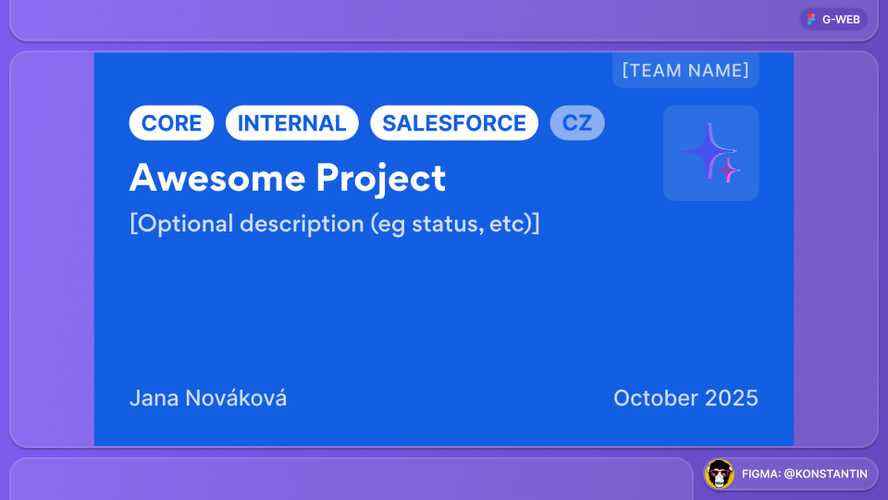
We updated the Figma George Design plugin with a custom design file template for Česká spořitelna:
- Custom Thumbnail
- Custom page structure
Move from npm to artifactory
Both repositories george-design-system and george-assets have been moved from npm to artifactory as the primary package registry.
This change improves security and aligns with our internal package management strategy.
StructuredInfo improvement
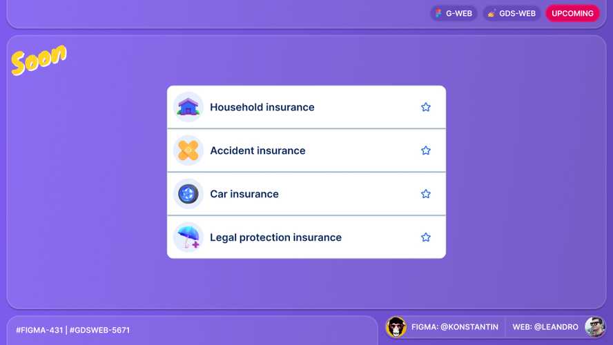
We soon will add support for SpotIllustration in the StructuredInfo component.
New Figma library: G-Translations
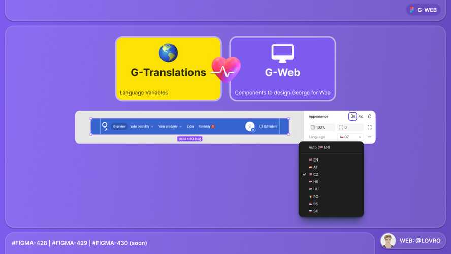
We introduced a new Figma library dedicated to translations. This library includes translation strings for specific components in currently eight languages (Czech, Croatian, English, German, Hungarian, Romanian, Serbian and Slovak).
Currently, the library provides translations for components such as Buttons (Back, Close, etc.), Collapsible, FocusPage, FullPage, PrimaryNavigation and Footer, DateInput and some Dropdowns; soon we will introduce Products and OverviewCard, with plans to expand further.
This library aims to facilitate user tests by providing easily accessible translation strings for various components.
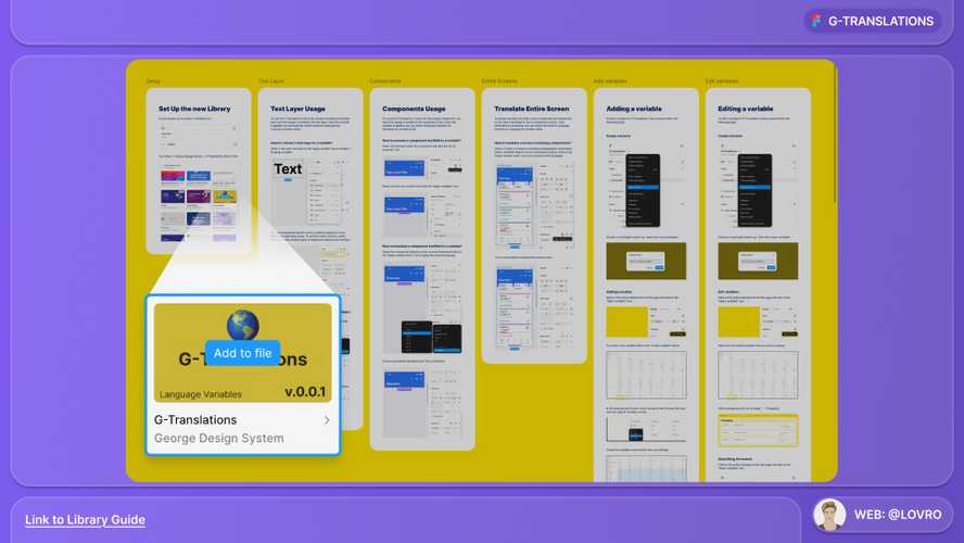
Check out the usage and contribution guidelines in the library itself within Figma.
Special thanks for developing this library to Lovro Batarilo. 🎉🥇👏
Thank you to everyone involved for their outstanding work on the latest Design System releases!