
Hello, Figma!
 Konstantin Demblin, Design System Lead
More than a year ago, the design chapter started to adopt another main design tool. This blog post shall give some insights into the motivation and the efforts that went into this transition. But before, let’s jump even further into the past!
Genesis
For the first years, George was designed in Photoshop, which might sound crazy, but this software, built for photographers in mind - hence the name - was widely used in interface design back then.
The term 50-shades-of-blue - for the many unintentional different shades of the colour blue in the interface of George - was coined back then, due to the limitations of the tool. 🙈

With a growing team and growing design demands, we moved away from Photoshop to Sketch, a design tool that has transformed the user interface design landscape once and for all. Sketch offered everything an interface designer wished for back then: Sketch was vector-based, provided the option to build design libraries for consistency and efficiency and had a huge community developed plugin ecosystem to extend the robust feature set of the software even more.
Due to the json-based file format of Sketch, something became possible that is a standard for software development for a very long time, but did not exist in the design world so far: version control and a git-like approach of developing and maintaining design at scale.
The third-party app Abstract helped us to store version controlled designs centrally and move away from design files named “design_v27_final_final.psd” stored on someone’s local hard drive.
Abstract also offered an inspect feature - handy for developer handoff to allow team mates to inspect a file and get valuable information such as colour, measures and distances without the need of a designer to write all the specifications by hand.
When Abstract introduced branching, it enabled explorations on the same design file without overwriting someone else’s work and finally, the design chapter did not have to tell others via a Slack message to not open a file simultaneously. Brave new world!
Over time, the disadvantages of two different applications, developed by different companies, became apparent:
When Sketch released an update, it took Abstract some time to support it too. Sometimes stuff even broke, when you updated too early. And both, Sketch and Abstract, became slower and slower over time.
These factors and design Twitter’s praise of the shiny world of Figma were the driving forces that made the design chapter start looking over the fence.
 checking out another woman passing by (=Figma) while holding hands with his girlfriend (=Sketch), who looks shocked and disgusted at him.")
What’s in store for George?
Figma, again, seemed to offer everything a designer could dream of. And it comes with some features that are unique or more advanced than its competitor’s software.
User management and structure
Similar to Sketch or Abstract, Figma (in its organization plan), offers teams and projects for better file and folder structure. We decided to stick with a Figma team per squad (with a few exceptions). It’s fair to say, though, that user management in Figma is not what makes this software shine. But if we manage to deal with software such as SAP, why complain?
Variants
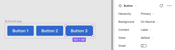
Variants allow building complex, yet easily customisable components.
Auto Layout
Auto layout helps building fluid components similar as developers do with Flexbox.
Figma is also great for collaboration, something Sketch adopted only recently. Multiple team members can work simultaneously in the same file which is quite handy for meetings (given that you have a clean file or are not scared of others peeking over your shoulder 😅).
Same as Abstract, it offers branching, although it is less advanced here, which probably is neglectable for daily design work, but makes it harder when maintaining design libraries.
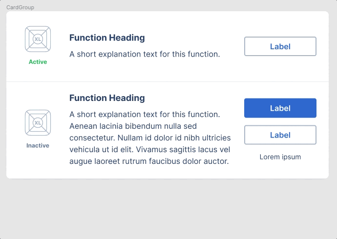
Design libraries
To allow our designers to move from Sketch to Figma, we had to build all the design libraries for web, iOS and Android from scratch, because there is no way to port library components from one tool to the other. The advantage of building everything again is to embrace the power of the tool and also question decisions you did in the past.
For the George web library (G-Web), we try to stay as close as possible to the React components (for naming, but also for usage of properties). Something we cannot do for iOS or Android, because the way Figma is built, clearly favours the metaphors for web development. While we have invested an incredible amount of time into the libraries, they are still not finished and improved constantly. The biggest downside to Figma libraries compared to Sketch libraries is that they cannot be shared meaningfully with someone outside your Figma organization - which is an issue we unfortunately have not solved yet for our peers working on George in the Erste countries.
 and its 768 instances - rotated horizontally and zoomed out to 3% to fit the screen.")
Some library statistics
Currently, we use ten Figma design libraries developed and maintained in-house. Together they consist of almost 1,000 individual components. Within the last week, almost 30,000 component instances have been inserted into the design files. The most used library components are Cell with more than 14.1k instances in 158 files from G-App and Badge with 11.2k instances in 156 files from G-Web.
Probably we should look into MenuDropdown/item in G-Web because it got detached 260 times 🙈 - maybe some designers who read this far, can tell me why?
Prototyping
Figma comes with its own feature set of built-in prototyping options. You can build click-dummies, but it can get easily quite chaotic and cannot compete with other prototyping tools such as Protopie.

—Image by Luke Dowding
Everything bright and shiny?
You might ask if Figma left no wishes behind. Well, overall, everyone working with the new tool seems to enjoy it.
Nevertheless, if a fairy would give me three wishes for features for Figma, that are available in Sketch, I might ask for a native (Mac) app, design tokens and Sketch Assistants. Maybe we will see design tokens become a native feature of Figma some day, but for my two other wishes, I wouldn’t be too optimistic.
Changes in GDS docs
Due to moving away from Abstract, we had to develop an alternative to the Abstract embeds that were heavily used in GDS-App to showcase George designs for Android and iOS.
Figma image

Figma images are API-fetched images (PNGs or SVGs) of Figma frames that are always up to date and provide a link to the design file itself for further details.
Figma preview
Technically, there are also Figma previews, iframe-like embeds of Figma files (or frames), but we do not encourage to use them, because compared to Figma images, they have their flaws.
What’s to come next?
We have some ideas on how to make more use of the powerful Figma-API and how to link GDS-web and Figma components more closely - and obviously, we are open and looking forward to suggestions from the team as well.
Last but not least we are thrilled to see where the journey of Figma will take us - and when it will be time to start looking over the fence again. 😉