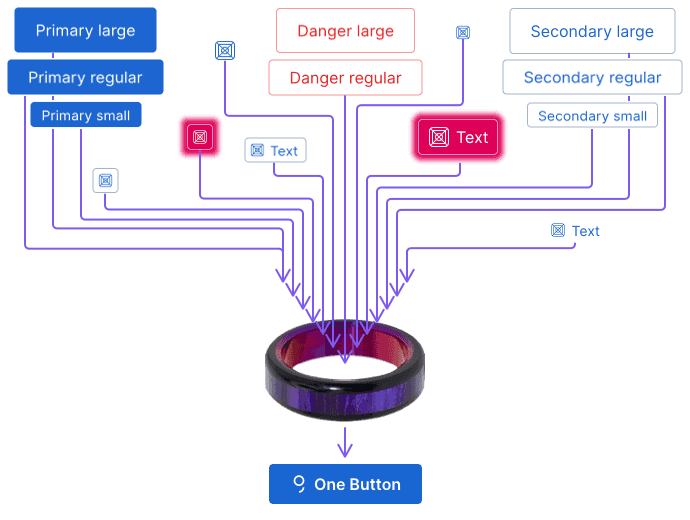
One button to rule them all

PrimaryButton, PrimaryIconButton, PrimaryLinkButton… All these complicated component names just didn’t have a good ring to it. It was time to go on an adventure.
Idea and approach
Now, we’d want to build a new singular component covering use-cases of all other pre-existing button components. But there are quite a few buttons across all of George and we sure as hell don’t want to break anything with our fancy new one.
Here are 2 things we had to consider:
- This new button follows the updated design provided by the Design Chapter and these changes could break existing layouts (e.g. the new one is 40px tall by default while old one is 36px tall)
- We wanted to give the Web Chapter a chance to migrate their old buttons at their own pace without any additional pressure
And so it’s been decided. We had to forge the One Button to live side-by-side the old ones.
Development
On the technical end, we wanted to keep the new button completely separate. A brand new .g-button CSS base class was introduced, making the new buttons independent from Bootstrap’s .btn base class as well.
Most of the configuration of the new button is done through enums:
The new design also unified the visuals of the buttons – a primary button always has a background, a secondary button always has a border, and a tertiary button has none.
Since the new component supports the modern React.forwardRef approach to passing refs to it, we had to come up with a completely new way to type the whole component in TypeScript (an exotic fact, there’s an interface called React.ForwardRefExoticComponent involved).
And finally, the new button is called NewButton internally, even though we export is as Button in the GDS compiled library – this is because there already is a Button component used internally within GDS for the old buttons.
Accessibility (A11Y)
The new Button components follows an A11Y-first approach. And since a video is worth a thousand pictures and a picture is worth a thousand words, here’s 1,000,000 words-worth video about the new Button’s A11Y.
How to migrate
Have a look at the documentation and examples for the new Button component or try the component out in Storybook.
Take your own time and follow the migration guide and let us know if you have any questions.
May the Button be with you, young hobbit.