Release highlights August
This blog post covers some highlights from the latest releases of GDS.
George-assets adoption
The George-assets repository is now fully adopted across all George clients – Android, iOS, and Web – for 3D illustrations, icons, or both.
This project was initiated and is actively developed by the GDS-WEB team. However, its successful adoption wouldn’t have been possible without the valuable support and collaboration of the mobile-, web frontend- and design chapters.
A big kudos to Leandro and to everyone involved! 👏

George-assets repository
Added george-assets as a new peer dependency. - Target: George-assets repository contains all assets used in George (icons, illustrations, animations) and is consumed by all clients of George (Android, iOS and web).
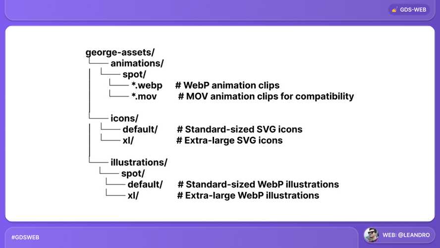
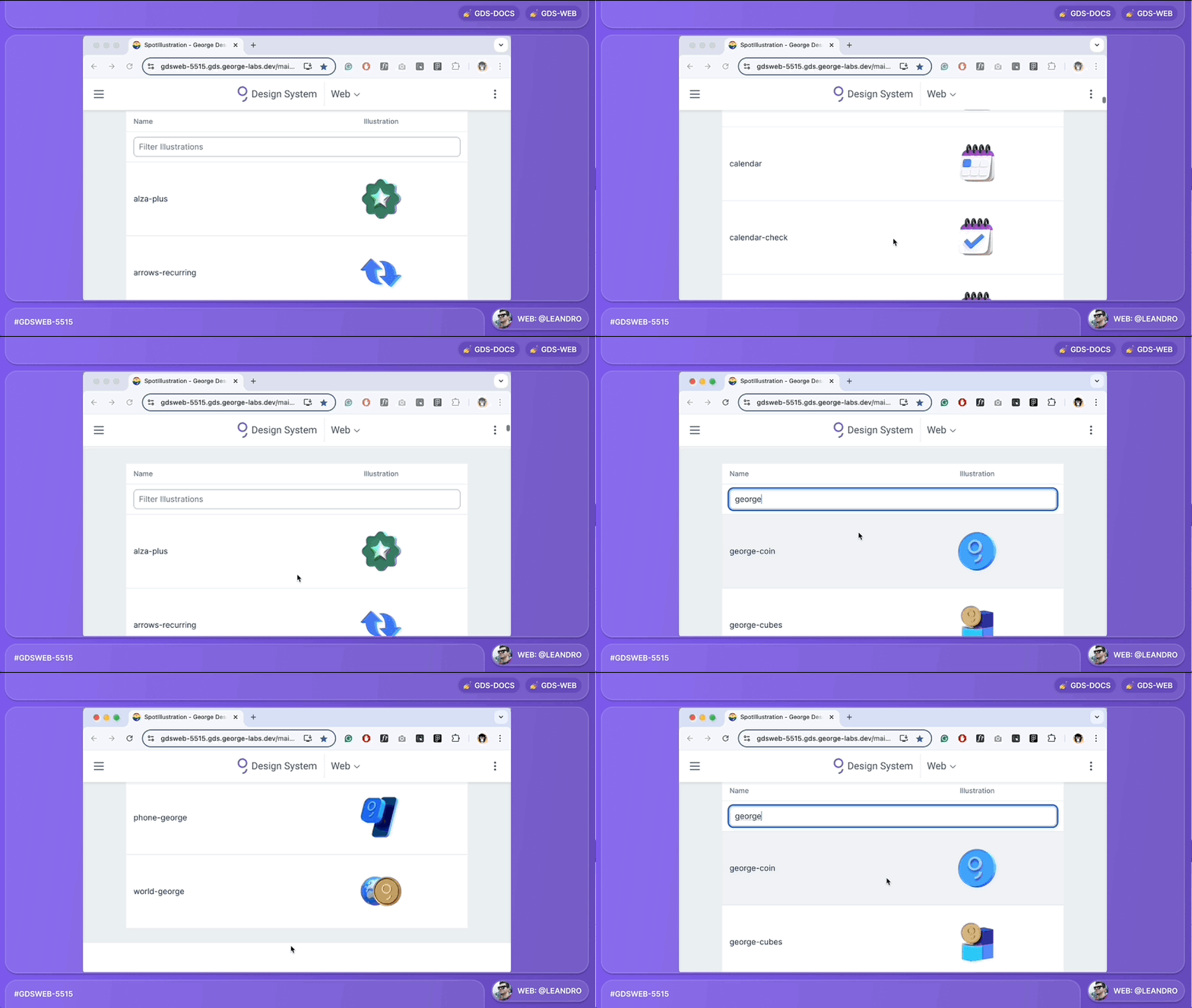
Added illustrations to GDS-docs
Illustrations from the George-assets repository are searchable from within the GDS documentation. Keep in mind: independent release cycles!
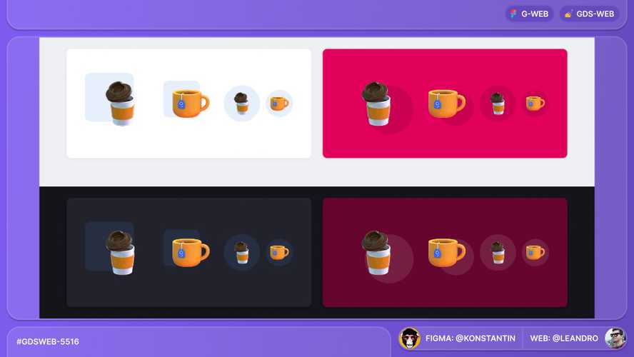
SpotIllustration: Additional sizes
We added three more sizes to the SpotIllustration component. There are now extra-small, small, medium, and large to support different use cases.
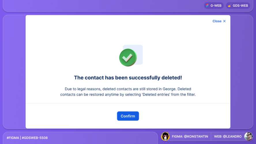
ConfirmationModal refactoring
We added support for SpotIllustration in the ConfirmationModal component.
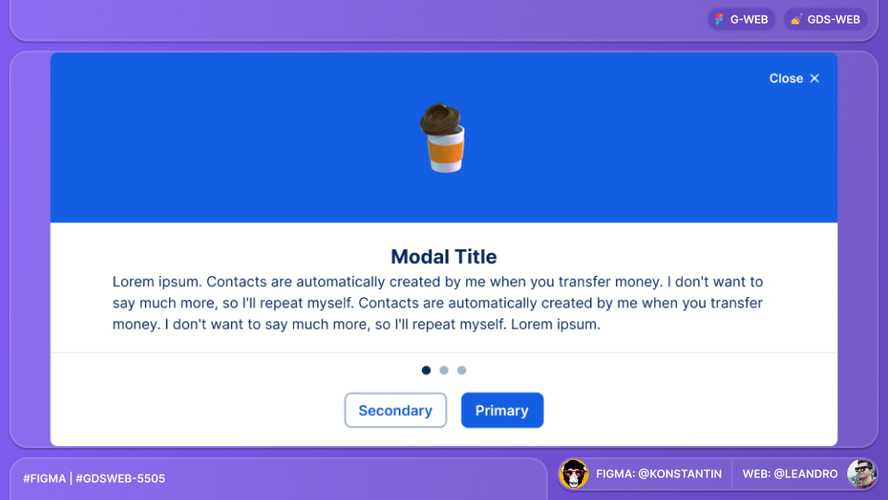
TeaserModal refactoring
We added support for SpotIllustration in the TeaserModal component.
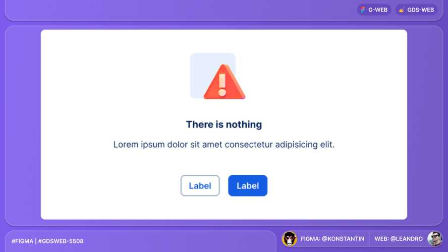
StatusInfo refactoring
We added support for SpotIllustration in the StatusInfo component.
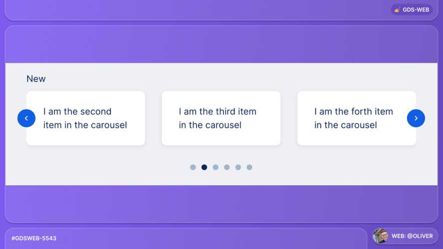
NewCarousel improvement
We added the showStepper property to display Buttons for stepping through the cards.
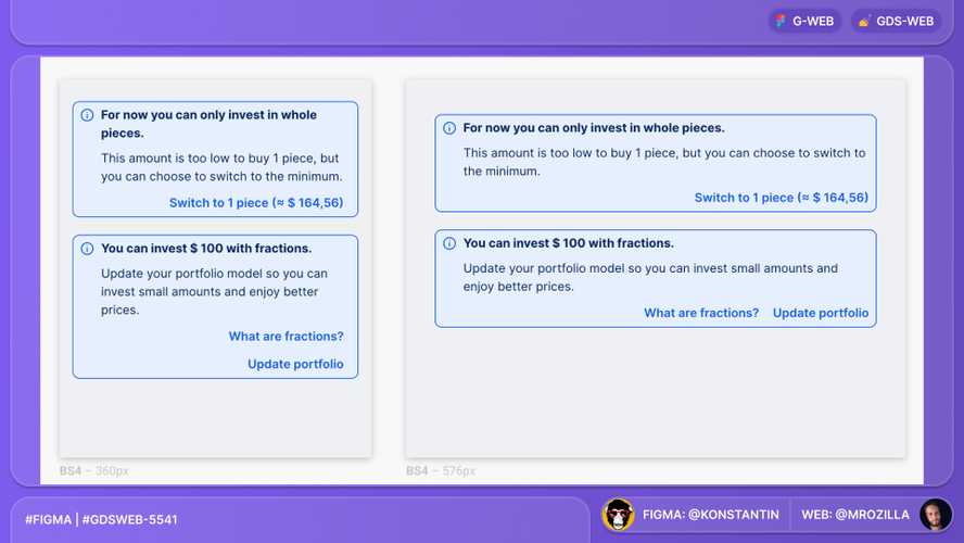
Small Alert buttons layout
We improved the layout of small Alert buttons to better align with the overall design.
Buttons in small Alerts will be placed
- XS tier: below the text and vertically stacked
- SM and MD tier: below the text and horizontally stacked
- LG and above tiers: right of the text and horizontally stacked
Thank you to everyone involved for their outstanding work on the latest Design System releases!