Release highlights April
This blog post covers some highlights from the latest releases of GDS.
Over the past weeks and months, our team has been heavily focused on two major areas: Accessibility and GDS v3.0.
Accessibility
Regarding accessibility, many of the improvements and fixes we’ve implemented will remain unseen—especially those related to screen readers and assistive technologies. However, we have also made noticeable enhancements, such as improvements to color contrast.
Accessibility is an ongoing journey; as new technologies emerge, best practices evolve, and browser support improves, our work continues. We are committed to delivering continuous accessibility enhancements moving forward.
In addition to addressing our accessibility backlog for components, we’ve seen a significant increase in accessibility-related questions from various George teams. To support them, we’ve also hosted dedicated accessibility workshops tailored to individual teams, helping them navigate this important yet sometimes challenging topic.
Dropdown keyboard accessibility
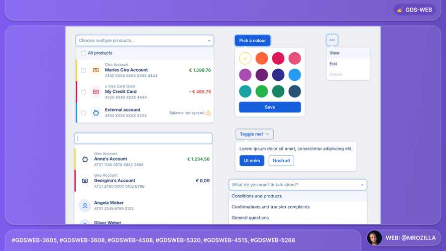
We have resolved keyboard accessibility issues in the Dropdown component. This update ensures that Dropdown can be opened, navigated and closed entirely via keyboard controls, significantly improving usability for keyboard users.
While this may sound like a small task, it was actually a major undertaking. The entire component was rewritten from scratch, all while preserving the existing API. Additionally, Dropdown was refactored to TypeScript for better maintainability and type safety.

Since Dropdown is a core component, these improvements also benefit other components that depend on it, including ColorDropdown, MenuDropdown,Select, ProductSelect and RecipientSelect.
Accessibility improvements on colour contrast issues

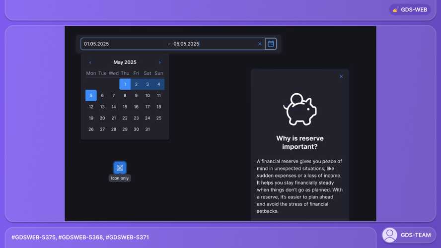
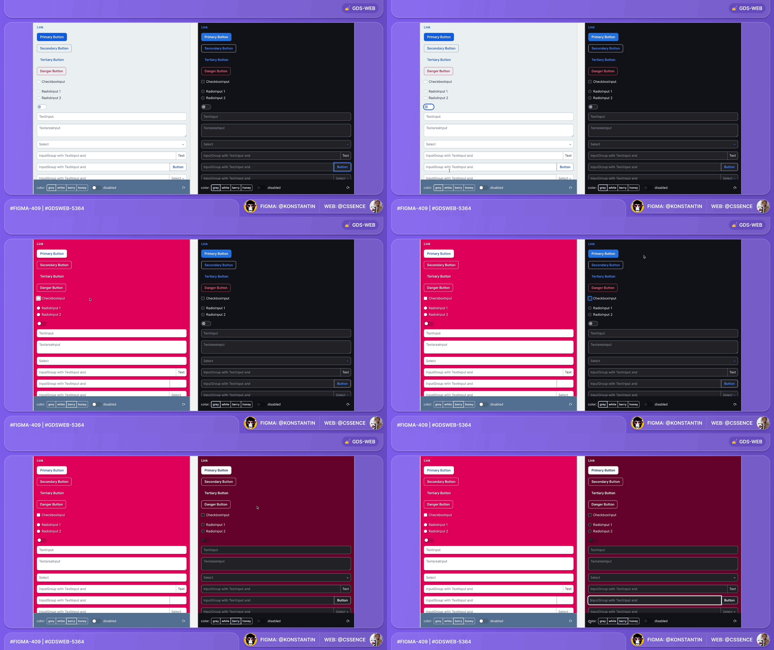
NewDateRangeInput: We fixed a dark mode issue - look at this improvement in Playroom.Button:Tooltipwill show on focus whenshowTooltipis set to true - look at this improvement in Playroom.ConfirmationModal: We fixed a dark mode issue with the icon color - look at this improvement in Playroom.Focus: We fixed insufficient contrast on focus indicator - look at this improvement in Playroom.

GDS v3.0
The GDS v3.0 release will be a significant milestone for us, as it marks the first major version update since the launch of GDS v2.0 in 2021.
We plan to release GDS v3.0 in about a month, aligning it with the start of the next George Web BoM.
Thank you to everyone involved for their outstanding work on the latest Design System releases!