
Release highlights February
 Konstantin Demblin, Design System Lead
This blog post covers some highlights from the latest releases of GDS.
Release of design-system v3.0.0-beta.0
We released v3.0.0-beta in January and are aiming for a stable version soon.
Check out the entire changelog here.

LabeledList
We added zigzag variant to LabeledList.

Look at this improvement in Playroom.
StripeActionButton
We updated StripeActionButton to show on scrolling to the bottom of page.
Look at this improvement in Playroom.
StepNavigation
We updated StepNavigation to support custom icons for completed steps.

Look at this improvement in Playroom.
A11y colour contrast: Badge
We updated Badge colours for a11y.

Look at this improvement in Playroom.
A11y colour contrast
- We updated primary Button dark mode background colour.
- We updated primary disabled Button dark mode background colour.
- We updated the color of the minimal Stepper.

AmountInput
We added formatOnChange prop to AmountInput. Formatting on change works only with precision={0}.
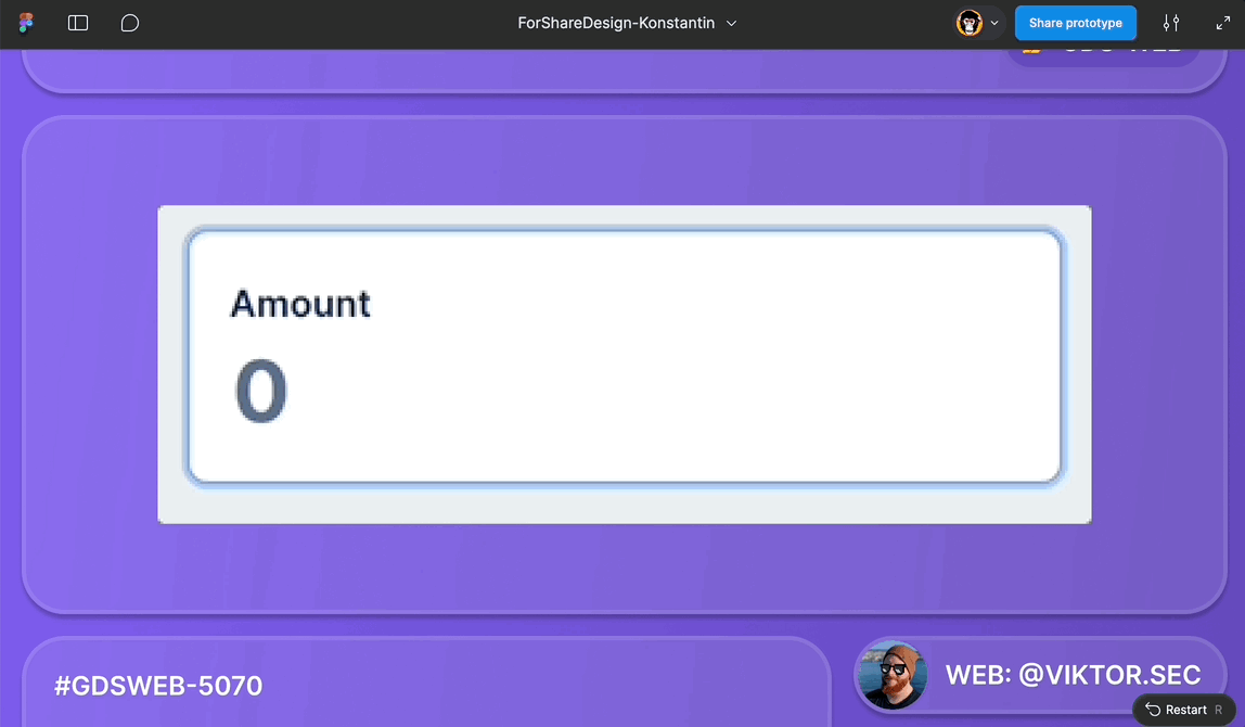
Look at this improvement in Playroom.
Small Alerts in small tiers
We updated the alignment of small Alerts in smaller tiers.

Look at this improvement in Playroom.
A11y colour contrast: ui-green
Updated ui-green colour value to meet a11y colour contrast.

FullPage
We added companySwitch prop to FullPage.

Look at this improvement in Storybook.
ProductCard
We added headingOverline prop.

DrawerNavigation
Menu item change: “Requests” -> “Approvals”

Look at this improvement in Storybook.
Signing
We added support for the signing component.
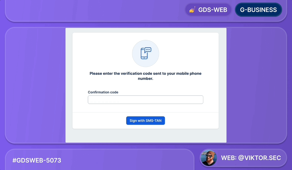
Look at a flow of the signing component in Playroom.
Look at a various examples of the signing component in Playroom.
Thank you to everyone involved for their outstanding work on the latest Design System releases!