Release highlights April
This blog post covers some highlights from the latest releases of GDS v2.68.0 and GDS v2.69.0.
Card update ✨
Code: Card got a new code property for padding (Card.PADDING.MEDIUM, Card.PADDING.LARGE)
Figma: George Figma library “G-Web” exposes new number variables for card padding (Card/padding/…)
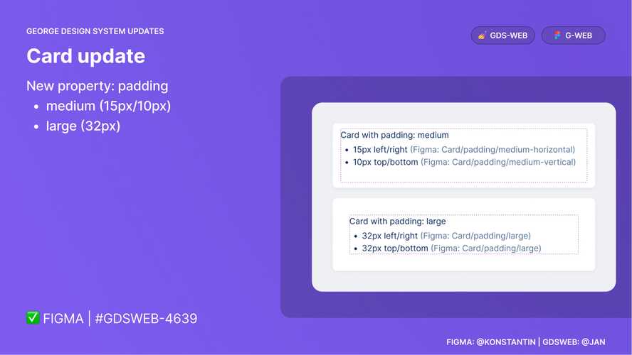
Hint This padding can be set both in code and in Figma individually, hence it is crucial to stick to aligned design patterns for consistency.
CAUTION With this change the automated padding overrides from FullPage got removed!
Learn more about this component and it’s use cases here.
ButtonGroup spacing update ✨
“Use ButtonGroup to lay out a group of Buttons.”
Code: Updated Button’s spacing in ButtonGroup
Figma: George Figma library “G-Web” exposes new number variables for Button’s spacing (ButtonGroup/spacing-horizontal(-small), ButtonGroup/spacing-vertical(-small))
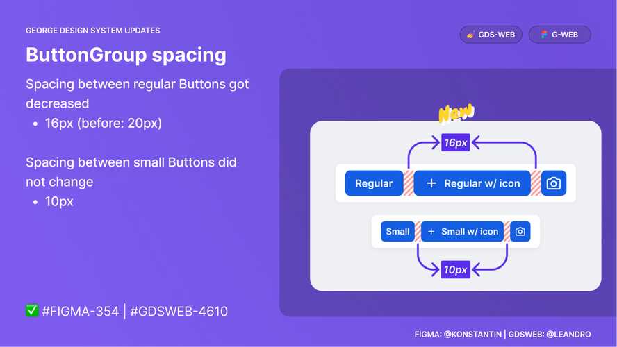
CAUTION This affects every ButtonGroup (with Button of regular size). This change was design reviewed carefully, however, it is advised to take a close look to see, if the reduction by 4px causes any visual issues.
Learn more about this component and it’s use cases here.
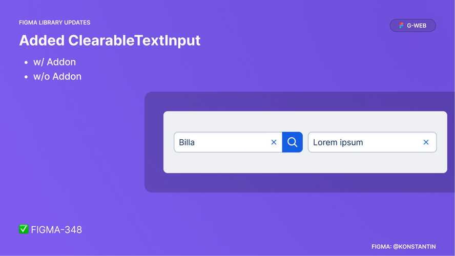
Figma: ClearableTextInput 🧑🎨
ClearableTextInput got added to the George Figma library “G-Web”.
Learn more about this component and it’s use cases here.
George Store updates 📚 🛒
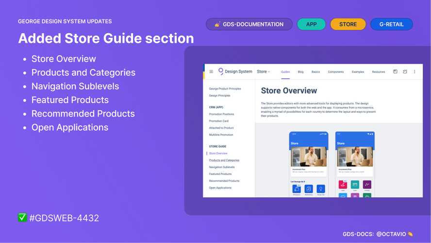
Added Store Guide section
Learn more about it here.
Added CSAS Product Page example
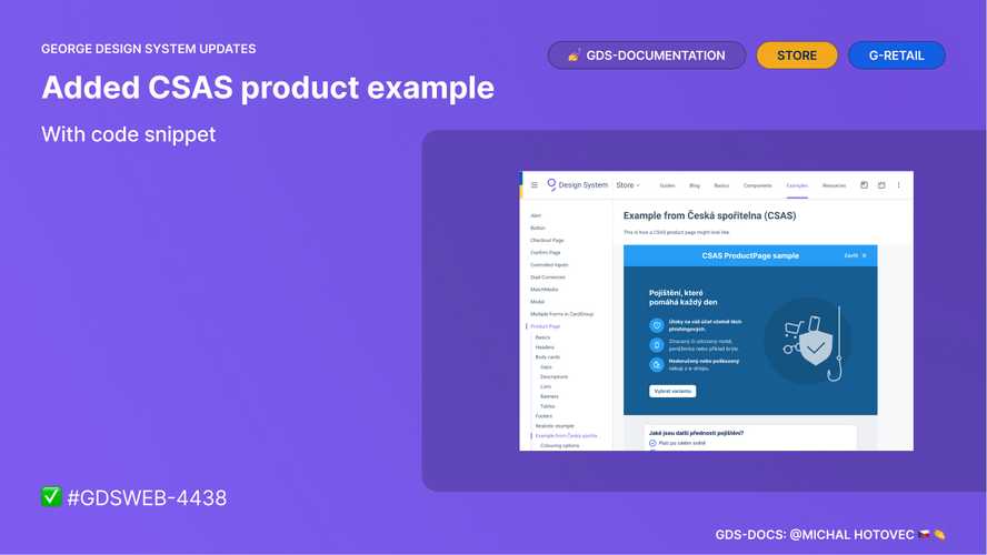
Learn more about it here.
Fixed CRM (App) section
Broken Abstract previews got replaced by Figma embeds.
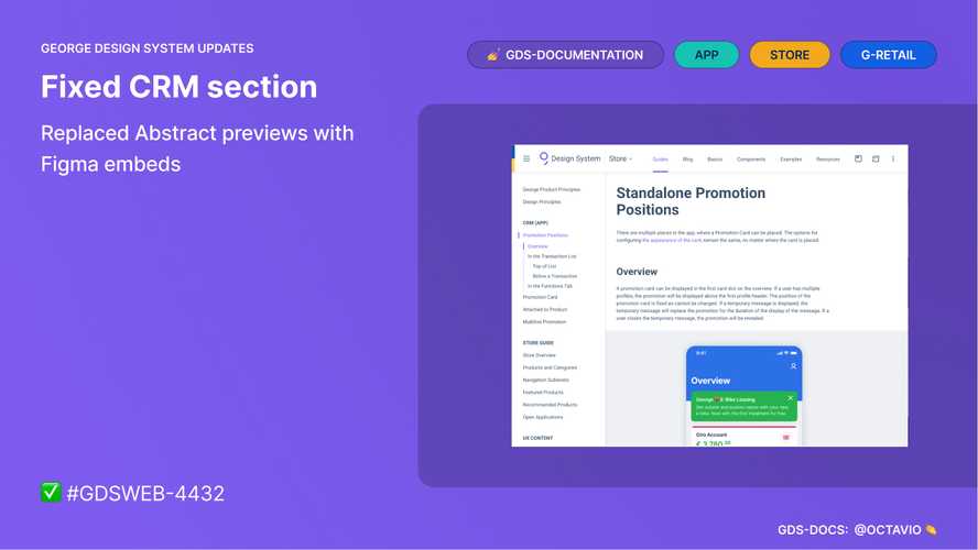
Learn more about it here.
Legend ✨
Legend is a new component.
Legend serves for providing accessible information related to a chart, a Meter, or a similar component that requires distinction between colors.
Hint As this is a new component, development teams will have to refactor existing custom implementations to make use of it.
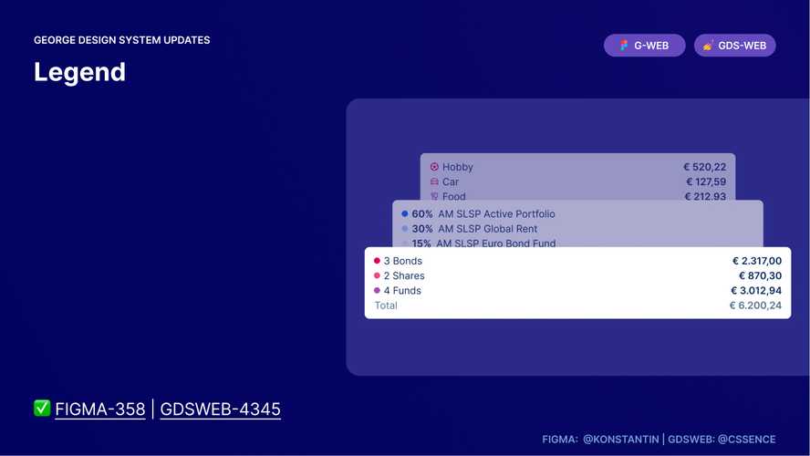
Learn more about this component and it’s use cases here.
FixedFilter ✨
FixedFilter is a new component.
FixedFilter is a component with a summary of transactions.
Hint To be used in George-Business.
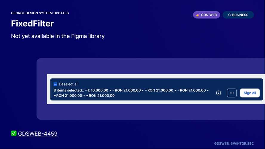
Learn more about this component and it’s use cases here.
Button 🛠️
This is an update to icon only Button.
Hint We have added a property to opt-in for this feature.
![]()
Learn more about this component and see it’s use cases in action in Playroom.
Updated Tab Styles 💅
Tabs structure and allow navigation between groups of content that are related and of similar importance.
Hint Tabs in applications using the latest version of GDS, will look different than before.
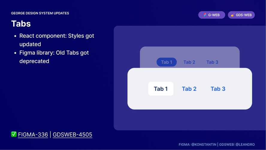
Learn more about this component and it’s use cases here.
FixedToBottom, FixedButton, Back to Top ✨
FixedButton is a new component, introduced with v2.66.0.
Some components float on top of content in a position fixed to the bottom of the page. These components need to be placed within slots of FixedToBottom component, which takes care of their positioning.
FixedButton is a button fixed at the bottom of the page. Back to Top variant of the FixedButton helps the user to get back to the top of the page.
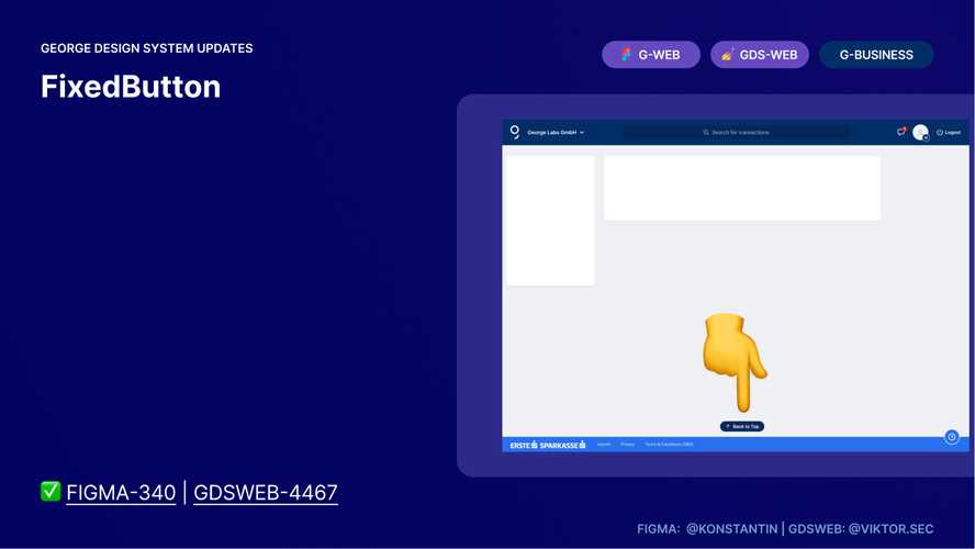
Hint To be used in George-Business.
Thank you to everyone involved for their outstanding work on the latest Design System release!