Less than 900 pixels
In 2019 we introduced what is arguably the tiniest feature in George Design System (GDS), yet it is about time to write a blog post about it.
Whatever you do, you usually stand on the shoulders of giants - in our case we took inspiration from the famous Google Doodles. We are talking about a small banner, you might call it an easter egg – fits to the time of the year, doesn’t it? – in the top left corner of the Design System’s header. When you hover with your mouse cursor over it, a tooltip unveils its meaning and clicking on the banner usually directs you to a webpage of the same cause.
We wanted to occasionally use a tiny, yet prominent part of the website to promote something, something we believe in or something worth highlighting. Sometimes it was fun to see how long it took our readers to notice a banner change.

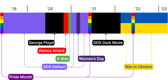
—Timeline of different banner topics over the years.
When in the beginning, the banners were only to stay for a short period of time, let’s say a few weeks, the current banner is up for more than a year. This is neither because we forgot to replace it, nor because we would have run out of topics. It simply did not feel right to switch back to GDS-default when there is a war of aggression in Ukraine, in parts of Europe.
To be clear: We don’t think that these initiatives have any measurable impact but it’s not about that. Nothing that really matters in life is measurable. Yet we believe that any - even the tiniest - touchpoint might cause something: a thought, a pause, a difference.
At some point in time, the banner will change again. Until then Слава Україні!