Hack in Style 2022

Let’s start by quoting last year’s blog post:
Every year, the GDS squad disappears for a whole week. For five days, our team puts on lab coats and dedicates time to adventurous exploration, bold experimentation, and precise execution. Five days of uninterrupted focus on bold ideas, creative collaboration, and team spirit.
Once again, we turned off Jira, gathered at Campus, and hacked away, from Monday to Friday.
Now that the week is over, let’s take a look at what has happened during #HackInStyle2022.
Our Topics
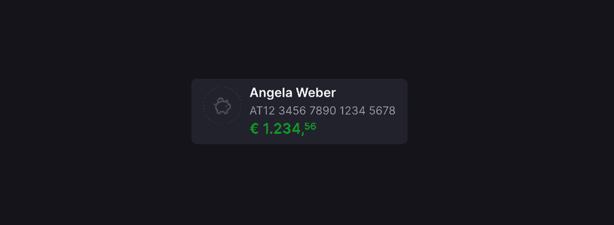
Dark mode
Dark mode (an inverted colour scheme using light text and dark backgrounds) seems to be everywhere in the last years. Many a device offers it natively and the ranks of websites offering it are getting bigger every day (we’ve actually added dark mode to this very website last year).

So why don’t we have dark mode available for George web? As it often is, the answer boils down to old, legacy code. Because with modern CSS variables, implementing dark mode is actually rather straight-forward:
css:root {
  --color-surface: #ffffff;
}

.dark {
  --color-surface: #000000;
}

.card {
  background-color: var(--color-surface);
}
Sure, George uses a few more colours and a few more components, yet in essence, this is all it takes—defining colour tokens, changing their values in dark mode and using them in component styles.
However, old parts of George are not always using GDS components, making those really noticeable if everything else switches to the dark mode. Such a change needs careful approach and Hackweek is the perfect time to try something of such scale out:
- Define a manual switch allowing the FE developers to enable dark mode for specific parts of the George web app
- Define semantic colour tokens (e.g.
--color-surface-primary) and their values in light and dark modes - Replace existing hard-coded colours with semantic colour tokens in tons of CSS files
- Find a lot of inconsistencies and try to unify those
- Make all existing components look the same but using CSS variables under the hood
- Switch to dark mode, find a lot of small issues and try to fix those
All-in-all, we’ve made quite some progress during the 5 days of the Hackweek. While implementing dark mode will absolutely require more time to make the transition as safe as possible, GDS is ready for it. And if you’re curious, you can take a sneak peak in a Storybook preview.
MenuDropdown a11y
One of the most challenging areas we face in terms of accessibility are the Dropdown components.
We have been continually looking into new options on how to improve on it and this hack week we took the opportunity to focus on one specific component - MenuDropdown.
We took WAI-ARIA’s recommendations to heart and altered the component to align with their pattern.
Random trivia: The recommended WAI-ARIA guidelines changed quite a lot even during the time we’ve been exploring the topic. It’s an unfortunate state of things — how various screen readers interact with browsers.
What have we changed?
- The structure of the menu is now a proper list
- The standalone MenuDropdown now uses aria that fits better (it is a
menuinstead of alistbox) - MenuDropdown now opens on pressing the down or up arrow keys, which highlights the first or last option respectively. This behaviour can be opted out if it turns out necessary to do so.
- Using arrow keys to change the highlighted item now also moves the focus. This is important for screen readers, since it lets them navigate through the menu using the simple arrow keys.
Navigating using the special screen reader keys naturally works as well, but for now, it is a bit different. The thing is, that MenuDropdown skips highlighting disabled items when using the arrow keys. This makes sense visually and provides a nice UX for a person who is looking at the screen. However, a screen reader user doesn’t hear those disabled items unless they navigate using the screen reader keys. Needless to say, it would be nice to improve on this.
What’s next?
Select components are mostly the same as they were, even though they use MenuDropdown internally. We would like to take a look at them next.
Project modularisation
jsx// Project internal future code snippet 🙌

import { MoneyIcon } from '@gds/shared-assets';
import { useMatchMedia } from '@gds/ui-hooks';
import { Card, Paragraph } from '@gds/ui-primitives';
import { Button, StatusInfo } from '@gds/ui-components';
With GDS now having had its 4th birthday already, not much has structurally changed since merging George Styleguide and Components into a single package. But a lot has been added and worked into the codebase since then, to the point where it’s hard to manage and overlook the internal dependency graph and each modification can have unintended consequences in seemingly unrelated locations. While keeping third party dependencies up to date isn’t only beneficial but also mandatory when it comes to potential security risks it’s become a small struggle to upgrade dependencies every few months. Moreover, four years in the web development ecosystem could be considered ancient, and lots of things have changed and evolved since then. New tools have been created, old tools have been abandoned and different standards have emerged.
So we thought it would be a good time to review some structural and architectural aspects of GDS that have stayed almost untouched over the years to lessen the friction that comes with certain maintenance tasks and future development. The initial goal was to create a skeleton project from scratch and slowly fill it with GDS code, adapting things where necessary while striving for a codebase that satisfies a few new key aspects:
- Make GDS more future-proof
- Namespaced internal modules with clear boundaries
- Establishing a hierarchy to restrict module imports
- Less dependency management pain
- Shared tooling (eslint, storybook, helpers, …)
- TypeScript across the whole repository
- Multiple packages to publish
- Adhere to established industry standards
With possible future developments like:
- Independent component versioning and publishing
- Automated dependency management
- Caching of package command results like build and tests
While tools like Nx and Turborepo provide a pretty good basis, examples and community support to make all that happen it quickly became apparent that this was way out of scope for a week of work. So the effort shifted towards establishing a battle plan to split this up into smaller, more manageable steps that still could provide a benefit on their own:
- Create aliased packages for core parts, symlinked in
node_modulesthrough yarn workspaces - Use a dedicated
package.jsonfor publishing - Abstract and move other packages one by one
- Split components into groups (and assemble them again through an aggregator package)
- Introduce additional tooling like Nx to help with maintenance
Web builder tools
When we talk about website builders, WordPress has been considered state of the art for many years. However, in latest years, a lot of no-code tools have appeared with the ambition of bringing web development to the next level.
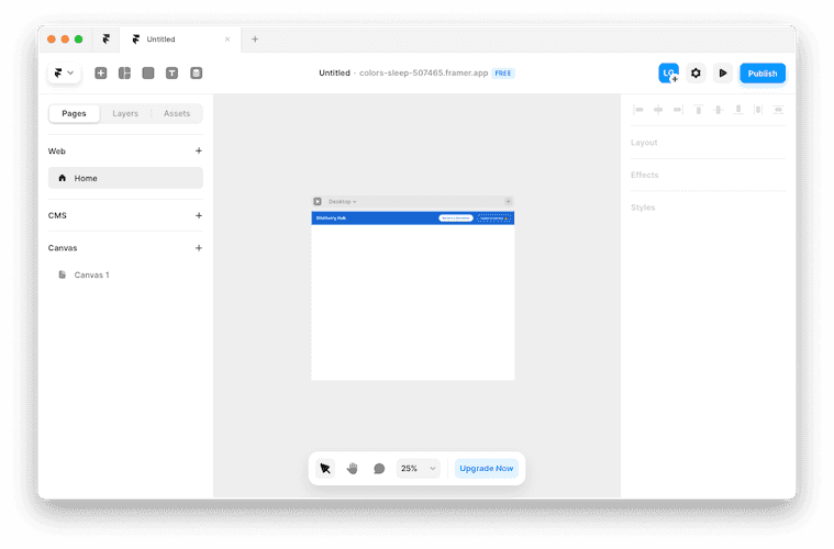
Both Framer and Webflow, for example, are capable and powerful professional tools used by thousands of people to run their websites (including CMS) and high-performing landing pages.
Webflow is a web builder that relies on HTML and CSS knowledge, such as classes. With Framer, on the other hand, the experience of building a website is very similar to the design workflow we are used to with Figma or Sketch – with extra features to make responsive websites.
Don’t get us wrong, Webflow is still a great tool and there are some things where it excels like: e-commerce and advanced logic. But Framer looks more “exciting”, especially for non-developers, and for sure we will see more tools following this paradigm in the future.

FigJam widget
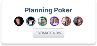
Figma allows the development of Plugins and Widgets. I have used the week to look into Widget development. As you usually learn the most by trying to achieve something specific, I decided to build a tool for our weekly internal complexity estimation.

The widget is considered to be a working prototype; it was interesting to explore options and some of the limitations of Figma/FigJam Widgets.
Testing and debugging a multi-user widget with - theoretically - a single Figma user, was a challenge of its own.
Feel free to give it a try and learn more about it at our George Labs (internal) Figma space. Feedback welcome! 😉
OverviewCards on mobile
George displays your products on the dashboard either as a list, or as cards on a grid. The number of columns in said grid is determined by your screen size. On mobile phones, there always has been just one column. Which made grid view and list view very similar: The only difference being, the cards contained more content than the list items. But in both cases you had to scroll vertically.
We created a prototype that displays cards horizontally on mobile. You swipe through your products from left to right, and thanks to scroll-snap being supported in evergreen browsers, you get the feeling of being in the native George App.

We’ll check with our designers, this feature might make it into George Web.
Wrap-up
Overall, it was a productive and exciting hack week for the GDS squad at #HackInStyle2022. We are proud of the progress we made and look forward to improving on and implementing these topics in the future. We are grateful for the opportunity to come together as a team, collaborate, and focus on our ideas, and we can’t wait to do it again next year.
The paragraph above was written by ChatGPT, a language model by OpenAI. 🤖