Hack in Style 2021

Every year, the GDS squad disappears for a whole week. For five days, our team puts on lab coats and dedicates time to adventurous exploration, bold experimentation, and precise execution. Five days of uninterrupted focus on bold ideas, creative collaboration, and team spirit.
But how does it work? Well, we turn off Jira, gather together on Monday and present our plans to each other. Sometimes a solo plan, sometimes a group of devs working on a larger concept together. Then we start hacking. And on Friday, we discuss the outcomes of those plans.
Also on that Friday, we thought you might like to read about what we worked on during #HackInStyle2021, so here we go.
Our Topics
Storybook new concept
For quite some time, our Storybook was presented as a simple change-this-prop-of-that-component tool. And hey, while this works, the platform can do so much more!
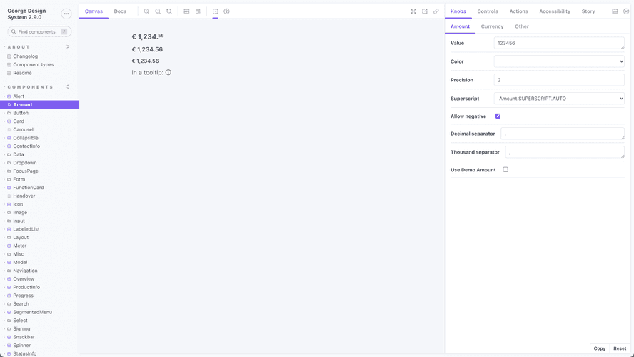
We’ve wanted to look at streamlining the experience for developers who use our components in their code. In conversations, two wishes kept coming up the most often:
- And overview of all possible props for a given component
- Code examples of possible configurations of a given component
So we’ve rolled our sleeves up and after some exploration we’ve found out that both of the wishes can, actually, be handled by Storybook itself! So now we’ve got a neat table with an overview of all the props & their descriptions and automatically generated code examples for every Storybook story, all while keeping the original functionality intact. Huzzah, what an outcome!
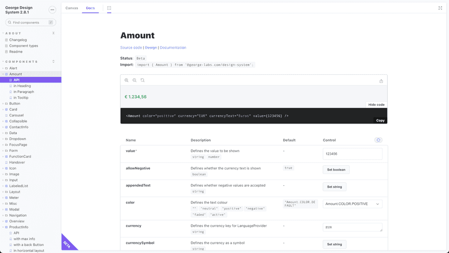
What’s next? Trying it in the wild, of course! But if you’re curious, you can take a peek at a little preview already.
Dark Mode
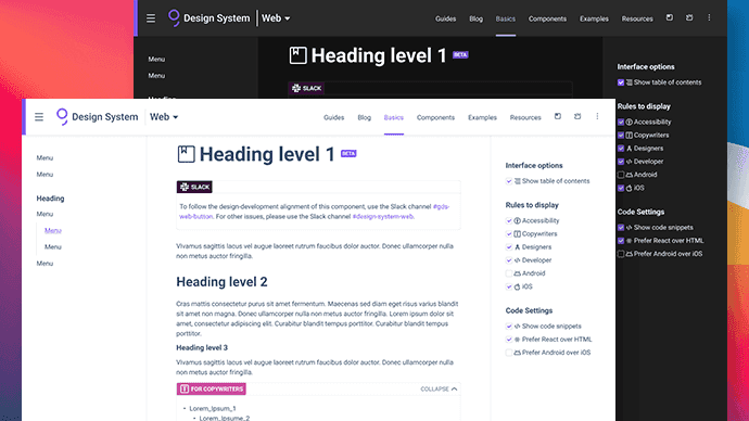
While it will still be a long way to go until we have Dark Mode in George Web, we figured it would be nice to have it in GDS. In the Hack Week we focused solely on the documentation, and didn’t touch Storybook and Playroom, as they are 3rd party tools (yes, they are customisable).
Dark Mode can be easy if you don’t use shadows/shades to denote hierarchy
. Well, guess what, GDS docs does use them. So at the end of the day week, we ended up with a dark palette that has more colours and shades than its light counterpart. Now that everything is done, the GDS documentation has a light and a dark theme, and you can pick the one you like more. By default we display the theme based on what your Operating System (OS) looks like.
The main takeaways:
- Styling aspects have been easy, as we could look up best practices online. Dark Mode on the web has been around for a while, adding it in late 2021 didn’t put us ahead of the curve.
- Technical aspects have been a piece of cake too, as GDS Docs already had a way to persist user settings.
- Controls (like Buttons, Checkboxes & Radios, Selects, etc.) can be challenging to style for more than one theme. Eventually, the light variant also had to be adjusted to make it work.
- Choosing text & background colours with sufficient contrast ratios in terms of accessibility is a story on its own. Tell the George New Colour Palette we said “Hi!“.
- FART (Flash of inAccurate colouR Theme) is a thing. 🍑💨
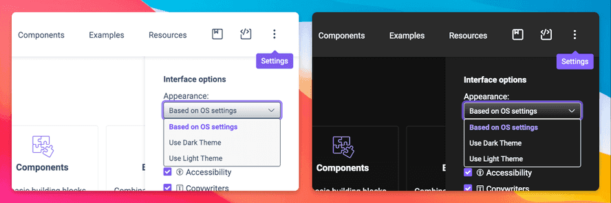
Wanna see it in action? Good news, GDS Docs Dark Mode went live with version 2.9.0, so if you are not reading this white on black already, turn on Dark Mode in your OS for maximum immersion, or just here under “Settings” (click the ⋮ vertical ellipsis in the top right corner).
Visual Regression Testing
Ensuring stability and consistency are major driving factors of a Design System. As GDS grows, it gets increasingly difficult to prevent unwanted changes in related components. In a third attempt to realise this, we now have visual regression testing through storyshots. 🙌
With a few modifications and re-implementing parts of existing third party software, we can now create screenshots of all existing stories, save them in the repository and compare them in future automatic test runs. On a pixel-by-pixel basis, the results are compared and the differences will be saved to the local file system.
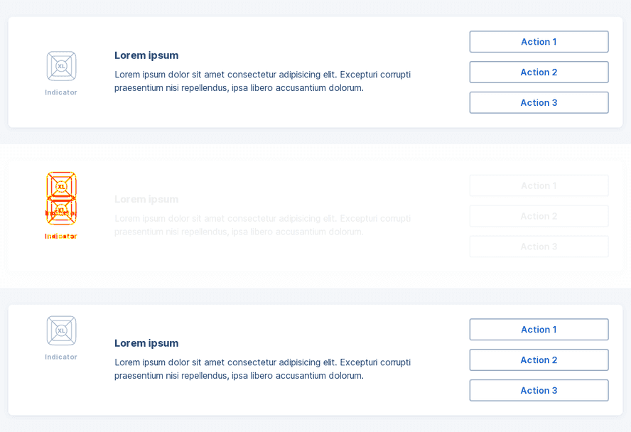
Currently, we are comparing three different tiers (XS/MD/XL) per story and with the move to Storybook controls and args, it will also be possible to capture the state of a story with different props or after certain user interactions. Think opening a Dropdown or checking all variants of a Button…
From Sketch to Figma
As you might know, the George Design Chapter decided some months ago to replace their primary design tool Sketch with Figma. Whilst this transition is in preparation for a very long time, the actual move has not started yet, nevertheless we thought it might be a good idea to re-build the design files that are needed to design the user interface of the GDS website in Figma right away.
What better way than building a design library for that and exploring a great Figma community plugin, Figma Tokens, on the go?
Using design tokens (colour) for it seemed to be the right choice also because we were working simoultaneaously on a related topic…
There have been quite some learnings from it, the most trivial one potentially being:
It’s not smart to call a colour token “white” when you consider adding dark mode to it later on… 😅
Figma Plugins and Web API
Designers often face a lot of manual tasks when using design tools so it’s important to think about ways to improve and automate the design process.
Figma has done an amazing job in removing a lot of complexity by providing out-of-box APIs and great documentation. However, each team is different so it’s important to find efficient ways to improve our own internal workflow.
After some experiments we managed to build a couple of demos which will lead the way to a tight integration between our GDS website and the Figma libraries.
First, using the Figma Web API, we’re now able to fetch assets (as PNG) from Figma files as an alternative to Figma embeds. This will be particularly useful for the App section in GDS, because it will allow us to always display up-to-date images without granting access to the Figma file itself.
Secondly, we created our first custom Figma plugin which automatically links our Figma components to an updated documentation page in the GDS website. This makes sure all the relevant information can be accessed quickly when browsing through design libraries.
For now, these are just POCs mostly due to security reasons that we need to address, but we’re really excited with the potential of these features, and we can’t wait for you to try them out!
Wrap-up
We concluded that the forth instalment of our annual hack week may have been our most successful one so far. Needless to say, we are looking forward to next year.