
Input
Standard Input
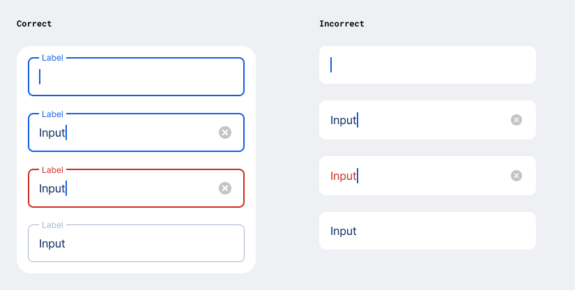
Input Fields are text fields that are used so users can provide a custom value like a names or numbers. They have various different visual styles depending on the OS and their specific state.
Use the respective Figma Component Variants to make sure the styling is correct.
It is considered best practice to limit the usage of input fields to one per view. This way, either the Page Title or Section Header can be used as a “label” to provide information for the user which type of input is expected.

Similar to Cells, Input Fields can feature a leading icon which provides a visual hint to the expected input.

In addition, a trailing icon can be used to trigger actions to fill the input field without typing manually. Examples are: launching the camera to scan a code instead of typing it, or opening the address book to select a contact instead of typing.

Once the input field received input by the user, a “delete” icon is shown on the right hand side which makes it possible to delete the input with one tap.

Rules For Android
- Use
InputField, see GitHub:BasicInputField.kt - For leading or trailing icon see the Compose preview example.
Floating Labels
The Android specific feature to show a floating label on text fields does not work with our design principle of background & surface colors.
Use them only if you can group multiple input fields inside a card.
Multiline Text Input
Use this component when the expected input value exceeds the typical length of a single line, and should not appear truncated.

Rules For Android
- Adjust the parameters
singleLineandmaxLinesto set a multiline text input or restrict to single line.
IBAN Input
This is a special variant with specific built in validation mechanisms to verify different bank account inputs in George.
- The leading icon switches to the corresponding flag once the country of the account is recognized.
- Input is separated into groups of 4 to increase readability.
- The input field switches to an error state if an invalid number is provided.

Rules For Android
- Use IbanInputField
- Can also be used as read-only text field for IBANs
Search Input
This is a special variant built for instances where the input is used to trigger a request to the backend to return a number of elements as a result.
- The leading icon is always the “magnifying glass”.
- It is often paired with Filter Chips to offer additional options to the user.

Rules For Android
- Use
SearchInputField
Amount Input
This is a special variant built for instances where a featured input for a numeric amount is needed. It has a number of settings that could not be achieved by using a standard input field.
Rules For Android
- LargeAmountInput - currency below
- SmallAmountInput - currency trailing
- SecondaryAmount - read-only display of foreign transfer amount in combination with a small amount input.
Currency Add-on
An element below or next to the value that can show
- a fixed currency as a text string
- a fixed currency with a flag-asset and text string
- a button that opens a sheet or modal to change the selected currency

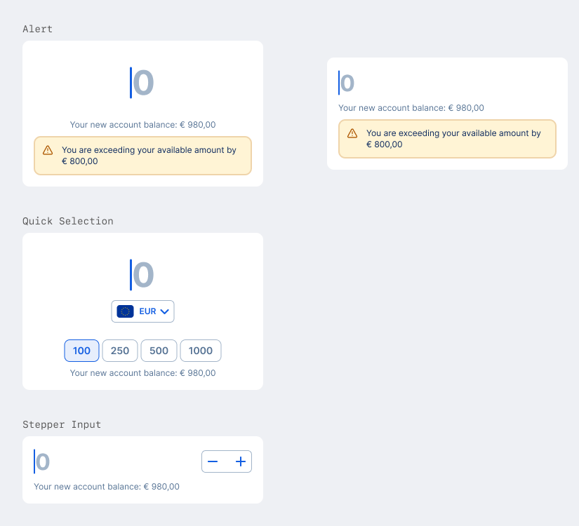
Additional Elements
In addition to the currency add-on, the big amount input can feature
- a description text
- a group of quick-selection buttons that alter the input to the respective value (only available in the Large Variant)
- an alert that appears depending if the given input triggers a specific rule
- a stepper input that enables the increase/decrease of the input value without typing (only available in the Small Variant)
PIN Input BETA
There are multiple instances in George where a PIN or Code input is required. However, there is currently no aligned solution for it available. Once this has happened, a Figma Component and specifications for an aligned implementation will be published.

Rules For Android
- Not implemented in GDS
- Contact GeorgeID team if needed as component