
Alert
An alert gives users important information they need right away.
For example, an alert can tell people about a problem, warn them when their action might destroy data, and give them an opportunity to confirm an action they initiated.
There are different types of alerts that can be used in George App:
Content Alert
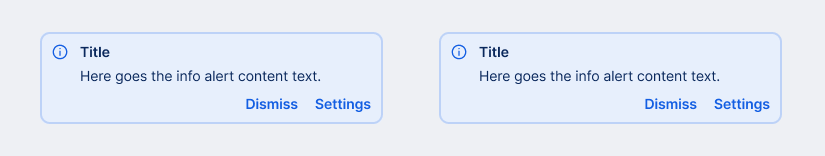
Content Alerts can have one of three semantic types defined for George and consist of a complementary leading icon, the actual alert message and up to two Actions the user can take to react on the alert.
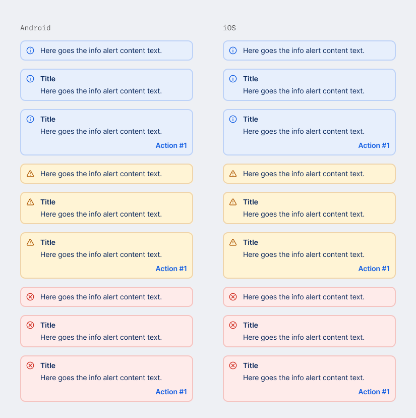
Types
Info
Communicates additional contextual information, which is not crucial for a task to be performed.
Example: When the user can proceed with a task, and there is additional useful information, or a dependency to take note of.
Warning
Shows crucial information with higher emphasis than Info. However, it is not blocking the user from completing a task.
Example: When the user can proceed with a task but is warned that there are consequences to consider in doing so.
Error
Displays critical information which blocks the user from proceeding in performing a task.
This type may also be used to inform about technical errors that occurred without the fault of the user.
Example: A transaction could not be signed successfully due to an authorization error.
Dismissing a Content Alert
Alerts are set to be displayed permanently in a given view. However, if it is important to give the user a chance to dismiss the alert, one of the two available Actions can be used to offer this option.
Rules For Android
- Github: Alert.kt
Alert(parametertypecan beAlertType.Info,AlertType.WarningorAlertType.Error)
Tokens
| Element | Token | Modifier |
|---|---|---|
| content | color.text.primary | |
| action | color.state.active | |
| icon error | color.state.negative | |
| icon warning | color.state.warning | |
| icon info | color.state.info | |
| border error | color.state.negative | opacity.medium |
| border warning | color.state.warning | opacity.medium |
| border info | color.state.info | opacity.medium |
| fill error | color.state.negative.weak | |
| fill warning | color.state.warning.weak | |
| fill info | color.state.info.weak |
Modal Alert
A modal dialog can be used to alert a user of an issue, or to request confirmation after a user-generated action. Modal Alert overlays and blocks page content until it is dismissed by the user.
A Modal Alert consists of a Title, a message and one or two Actions.

Rules For Android
- There is not current implementation in GDS.
- Use Material 3 AlertDialog
- Or GeorgeAlertDialog (in progress)
Tokens
Modal Alert is a native Component based on the design guidelines of the respective OS and does not use our Design Tokens.