
Button
A button provides a simple and familiar way to initiate actions. Usually, pressing a button results in an instantaneous action, but sometimes, a button may also trigger another behaviour, like opening a Sheet with additional actions.
Basics
Buttons consist of either a text label, an icon from our library, or a combination of both.
Rules For Copywriters
- Always remember to keep button labels short. Overly long text makes it difficult to grasp the buttons intended function and it may get truncated on smaller screens.
States
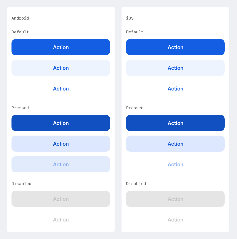
A button always has one of the following states:
Default
The initial appearance of a button - it is enabled and not interacted with
Pressed
The appearance of a button once the user interacts with it
Disabled
The appearance of a button that is disabled and cannot be interacted with by the user.
Sizes

Buttons are available in 3 different sizes for George.
Large
This variant spans the full width of the device (or the content area on tablets) and may only be placed anchored to the bottom of the screen (either alone or as part of a Button Group).
Medium
Should be used for Buttons that are part of a custom Card layout.
Small
Should be used for Buttons that are part of a custom Card or Cell layout.
Rules For Android
- Set one of
ButtonSizevariants. See Buttons.kt - Eg.
ButtonSize.Large,ButtonSize.MediumorButtonSize.Small
Button Types
Primary
Only the most important action on a given view or in a given element should use this button type.
The Primary Button is always filled, but depending on the underlying surface, it can appear either in our brand color or inverse (white)
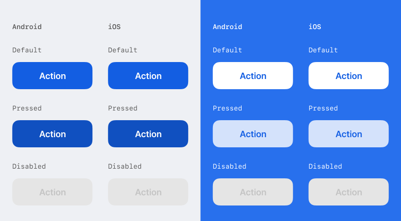

Rules For Android
- Use
PrimaryButtonfrom Buttons.kt - For the inverse variant (white on color) use
InverseButton. White button should only be used on surface brands or product colors.
Tokens
| Element | Default | On Color | Disabled |
|---|---|---|---|
| label | color.text.mono | color.state.active | color.text.disabled |
| icon | color.fill.mono | color.state.active | color.text.disabled |
| fill | color.state.active | color.fill.mono | color.fill.disabled |
Secondary Button
Secondary Buttons can only be placed inside container elements, not directly on background.
They are often used to highlight possible actions within a custom Card layout.
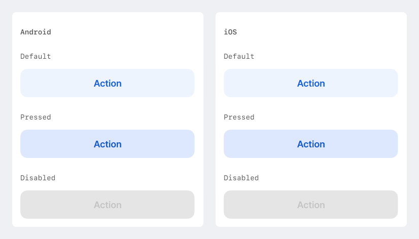

Rules For Android
SecondaryButtonin Buttons.kt
Tokens
| Element | Default | Disabled |
|---|---|---|
| label | color.state.active | color.text.disabled |
| icon | color.state.active | color.text.disabled |
| fill | color.state.active.weak | color.fill.disabled |
Tertiary Button
This is the button style with the least visual prominence. It is also used to show a clear hierarchy between two actions: The primary choice is rendered using the Primary Button style, and the other option uses the Tertiary style.

Rules For Android
TextButtonundInverseTextButtonin Buttons.kt
Tokens
| Element | Default | On Color | Disabled |
|---|---|---|---|
| label | color.state.active | color.text.mono | color.text.disabled |
| icon | color.state.active | color.fill.mono | color.text.disabled |
Icon as Button
Some native mobile patterns are designed to have actions using icons without a supporting text label at all. A classic example are navigational patterns and actions in the top navigation bar on both Android & iOS.
Use a prominent color (blue or white) to indicate that an icon is actionable and not just a decorative element.
Consider ample space around such an icon-action, so that users understand and perceive it as a stand-alone action, and not as part of an adjacent element.

Rules For Android
- Use Material 3 IconButton
- Usually covered by other components
Tokens
| Element | Default | On Color |
|---|---|---|
| icon | color.state.active | color.fill.mono |
Button Group
A Button Group consists of a large primary and a large tertiary button that are stacked vertically and anchored the bottom of the screen.

Rules For Android
- Does not exist as component. Usually just a
Columnof buttons.
Favourite Action Button (FAB) Android
This component is Android exclusive. When using this component, always make sure to define a platform specific alternative for iOS.

The FAB represents the most important action on a screen. It floats on top of the content, in the bottom right corner and with a defined padding to the boundaries of the screen.
The default variant is the Extended FAB, but the button can be configured to either vanish on scroll, or to contract to the icon-only variant on scroll.
It is not permitted to stack multiple FABs on a screen, or to use the FAB for a destructive action.
Rules For Android
- Use Material 3 component like
FloatingActionButtonorExtendedFloatingActionButton - Design Spec
- Code Doc
Tokens
FAB uses the same token specifications as Primary Button.
Cell Button iOS
This component is iOS exclusive. When using this component, always make sure to define a platform specific alternative for Android.

On iOS, actions that would typically require a button, can also be achieved with this special types of a Cell. This can be useful if an action is related to a specific list of actions that are shown in a preceding table view.
Tokens
Cell Button is a native system component. Based on the iOS guidelines, a Cell Button can be either styled default or destructive.
Snowflake variants
Some of George’s features need specific button designs that are not intended to be used in other parts of the app.
Example A
Rounded, floating Icon Buttons on top of a Map in the ATM/Branch Search View.

Example B
A small Icon Button in the Compose Toolbar of the Messenger View.
