Pages outside of George
This section deals with servicing pages, functional pages, and tools (also referred to as third-party applications or external applications) outside of George but accessed via George. The users must know that they left George. Therefore these applications open up in a new browser tab, and the design is distinguishable from George. The design also differs from Emil to differentiate between marketing/promotional pages (=Emil/Gem) and servicing/functional pages. Hence it is in-between George and Emil: George - 3rd party - Emil.
Page Header
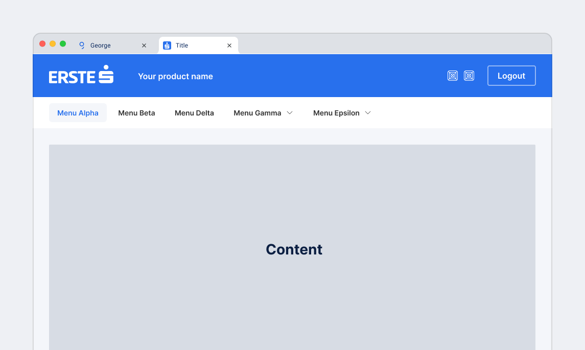
The page header unifies the appearance of all third-party applications accessed via George and opened in a new browser tab. It does not apply to third-party applications displayed within George.
Common use cases
Servicing pages, functional pages and tools
- User password change
- Managing third-party apps
- Contact management
- Financial health
- etc.
Desktop
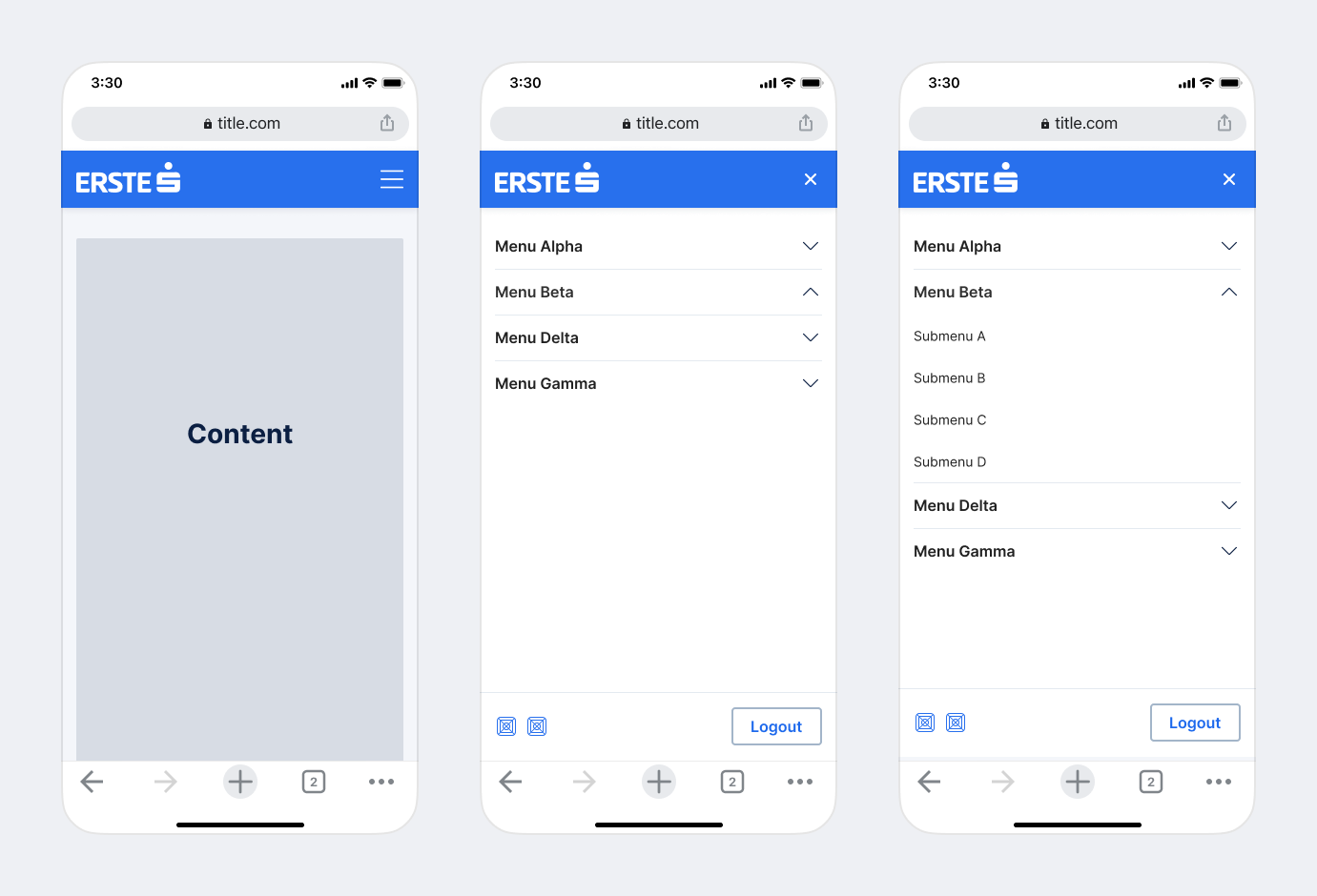
Mobile
Branding
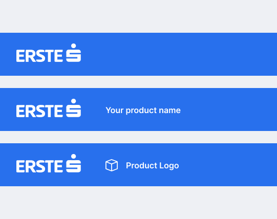
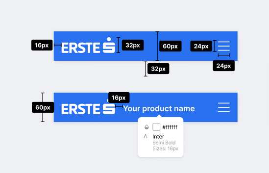
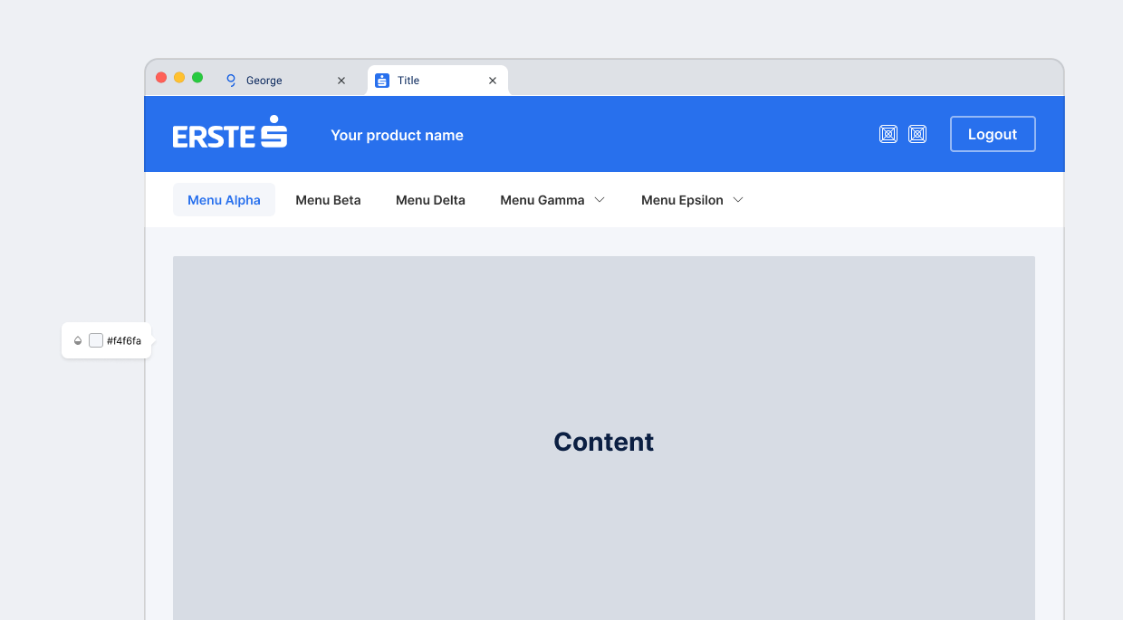
The branding is positioned in the left upper corner on the bright blue top bar. Be aware that in most cases the group logos have to be placed on the primary bright blue color. You’ll find detailed info in the Erste Brand Centre.
There are 3 types of branding
- Single branding
- Double branding with group logo + text (product name)
- Double branding with group logo + product logo
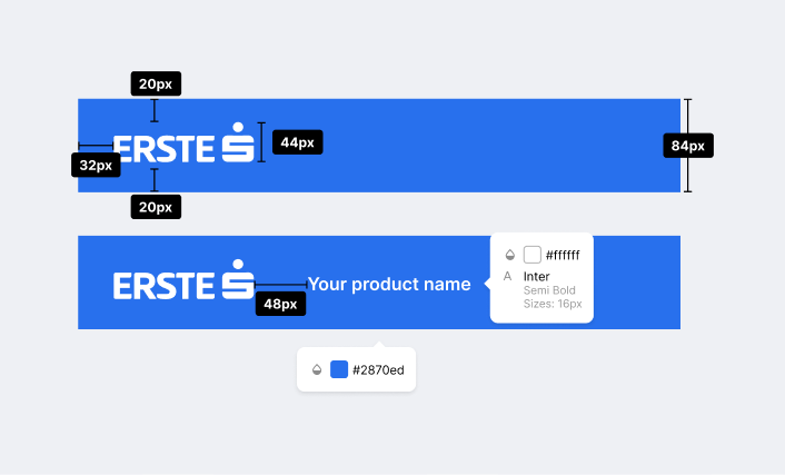
Desktop
Attributes
- Logo height → height: 44px;
- Bright blue top bar → height: 84px;
- Product name text → font-family: Inter-Semibold; font-size: 16px; colour:
$color-white (#ffffff)
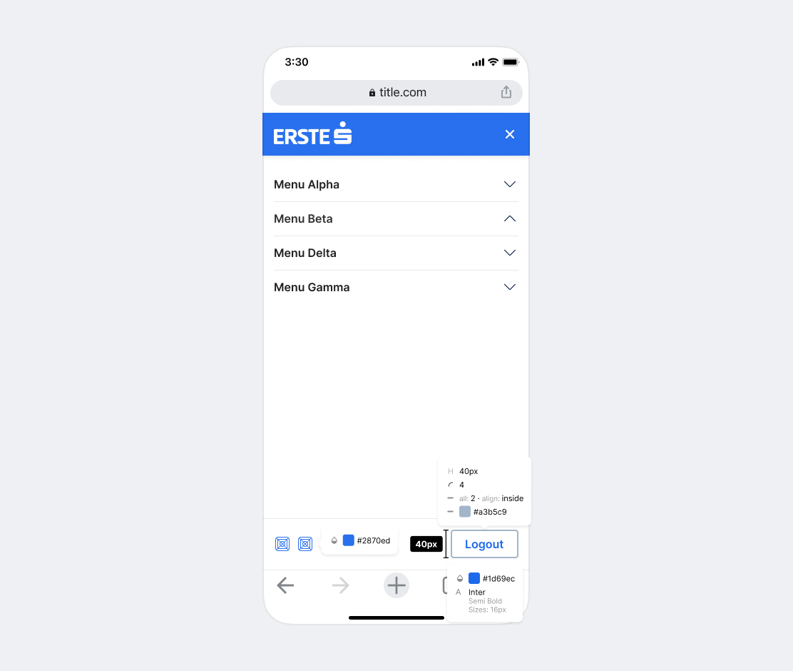
Mobile
Attributes
- Logo height → height: 32px;
- Light blue top bar → height: 60px;
- Product name text → font-family: Inter-Semibold; font-size: 16px; color:
$color-white (#ffffff)
Main Navigation Bar
Desktop
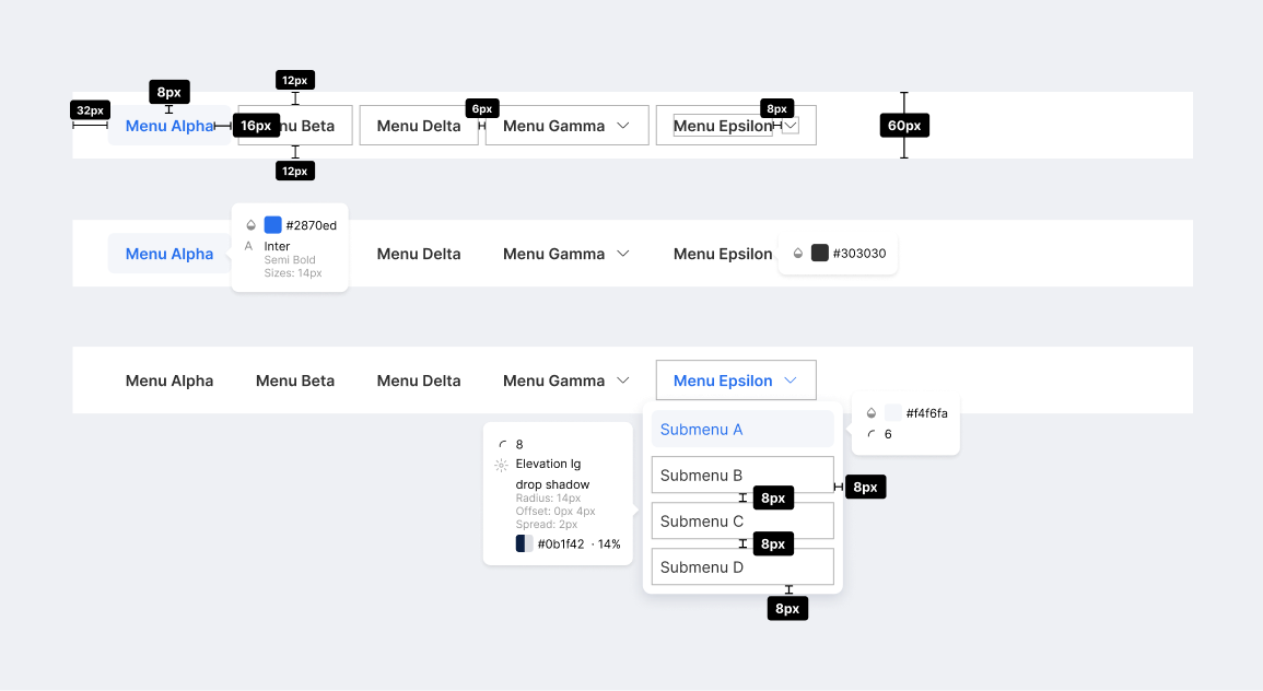
The Navigation is positioned below the Bright Blue top bar.
- The selected menu item is marked by changing the label color to Bright Blue.
- Menu items with dropdown functionality are marked with a downward arrow.
Attributes
- Navigation bar → height: 60px; background-color:
$color-white (#ffffff) - Menu item → font-family: Inter-SemiBold; font-size: 16px; colour:
Anthracite (#303030); padding: 8px 16px; border-radius: 6px; - Menu item hover → font-family: Inter-Semibold; background-color:
$color-gray-100 (#eef0f4)font-size: 16px; - Menu item active → color:
$color-blue-bright (#2870ed) - Dropdown item → padding: 6px 8px; border-radius: 6px;
- Dropdown item hover → background-color:
$color-gray-100 (#eef0f4); color:$color-blue-bright (#2870ed)
Mobile
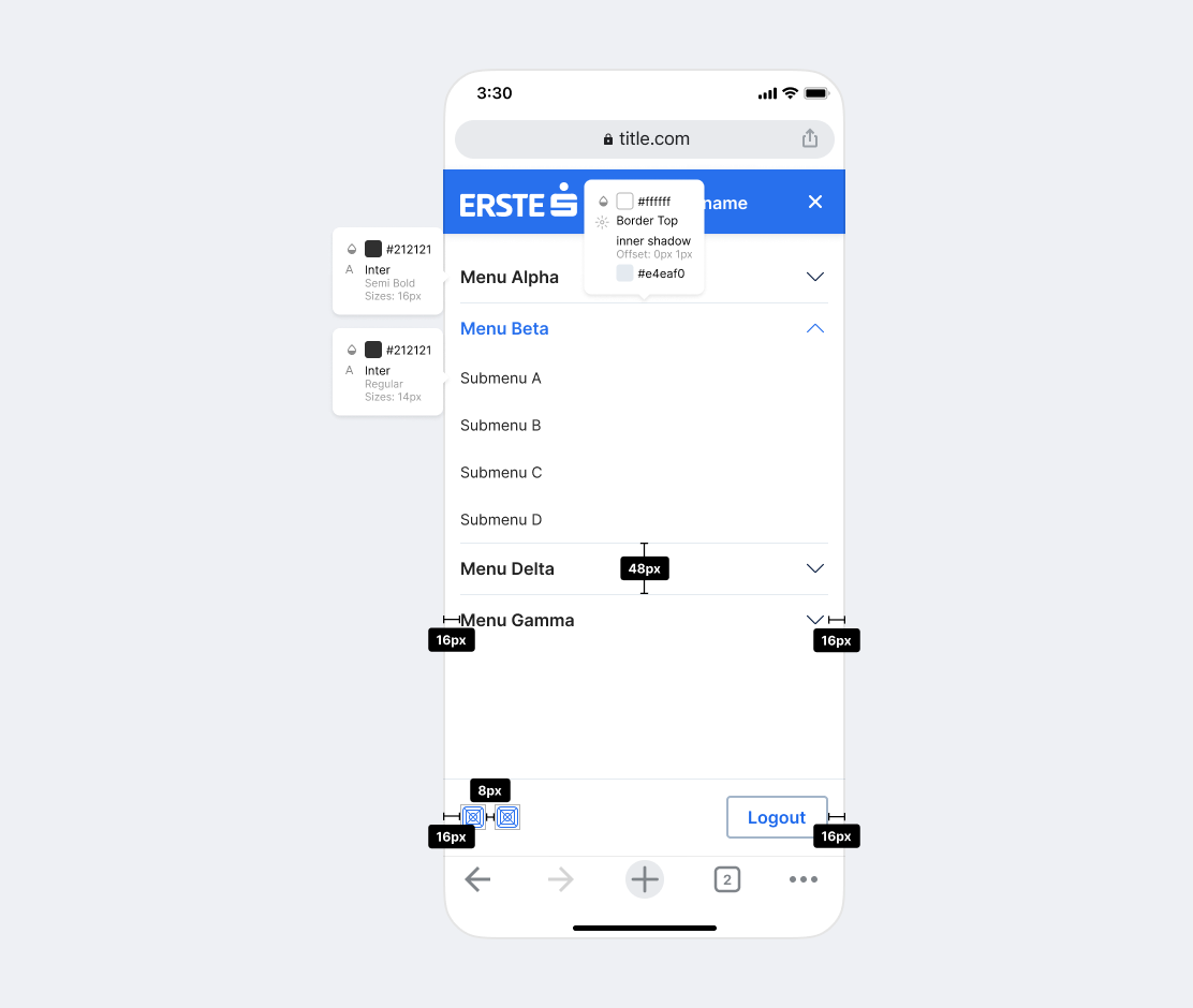
The Navigation is positioned below the Bright Blue top bar on mobile as well. The navigation menu button displays the menu items on top of the whole content spanning through the whole viewport. The secondary buttons are sticky to the bottom of the navigation sheet.
- The selected menu item is marked with changing the font color to the
$color-blue-bright (#2870ed). - Menu items with dropdown functionality are marked with a downward arrow.
- The navigation sheet can be closed by tapping on once again on the navigation menu button that now transitioned to a cross.
Attributes
- Menu item → font-family: Inter-Semibold; font-size: 16px; color:
Anthracite (#303030); line-height: 24px; - Menu item separator → border-top: 1px solid
#E4EAF0; - Menu item active → color:
$color-blue-bright (#2870ed); - Submenu item → font-family: Inter; font-size: 14px; color:
Anthracite (#303030); line-height: 20px; - Menu item container → height: 48px;
- Menu item separator → 1px solid color:
$color-gray-200 (#e4eaf0)
Meta Navigation
Desktop
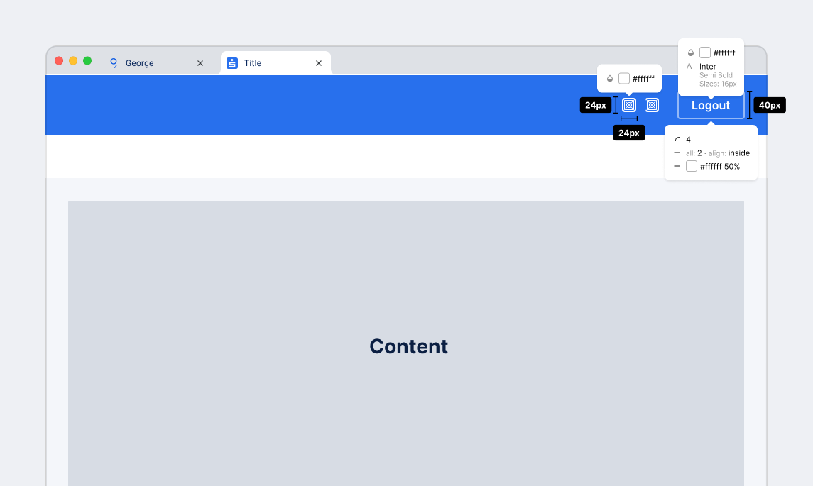
The meta navigation is positioned in the right upper corner on the Bright Blue top bar.
- The logout button, if needed, is always on the right side.
- Icons for meta functionalities (e.g. notifications) are placed left to the logout button. Never use the same icon twice, since George is distnguishable.
Attributes
- Icons → size: 24px; color:
$color-white (#ffffff) - Button → height: 40px;
Mobile
On Mobile, the meta navigation is sticky to the Footer when the Navigation is displayed.
- The logout button, if needed, is always on the right side.
- Icons for meta functionalitites (e.g. notifications) are placed on the left side of the container. Never use the same icon twice, since George is distnguishable.
Attributes
- Icons → size: 24 x 24px; colour:
$color-blue-bright (#2870ed) - Button → height: 40px; border: 2px solid
$color-gray-300 (#a3b5c9); border-radius: 4px; font-family: Inter-Semibold; font-size: 16px; colour:$color-blue-bright (#2870ed);
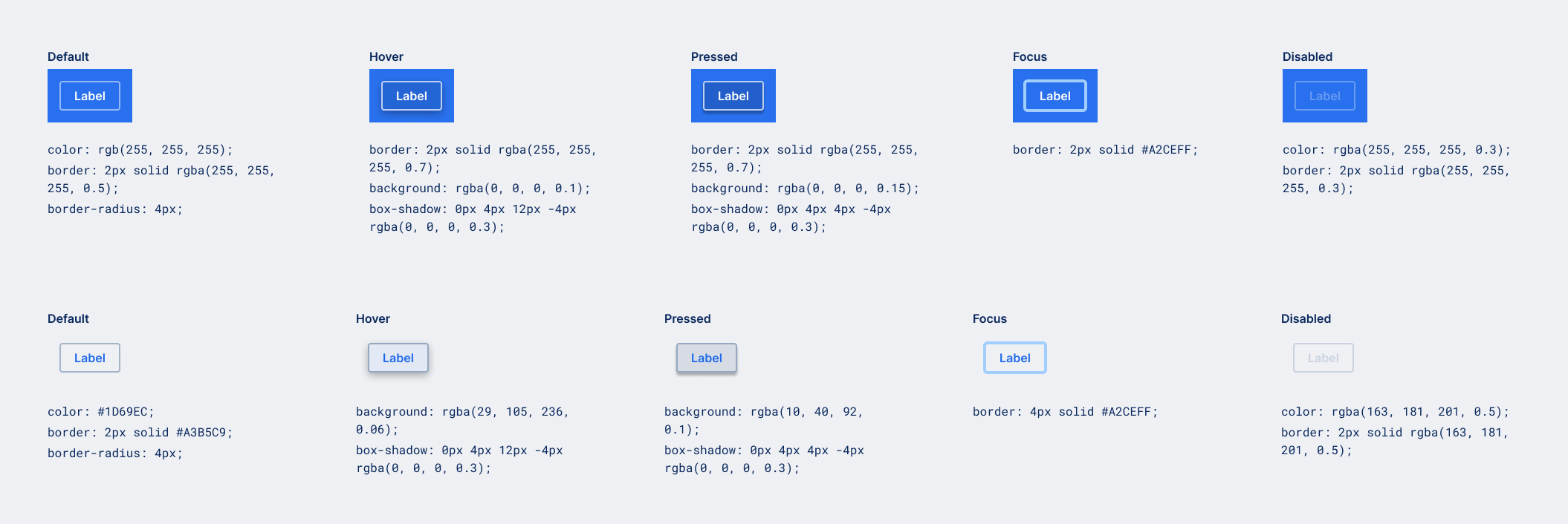
Button States
Content
The content area can be freely defined.
Attributes
Background → background-color: $color-gray-100 (#eef0f4);
