Release highlights December
This blog post covers some highlights from the latest releases of GDS.
Accessibility improvements
We focused for (almost) an entire sprint on accessibility but as most of it is neither visual nor can easily be described in a few words we will only mention part of what we have accomplished:
- Avatar got some improvements for screen readers - you can read more about it here
- PrimaryNavigation’s mobile menu now follows a11y standards for focus management
- DropdownFooter shows a proper focus ring when needed
- TransactionDetail better reflects what is shown on screen for assistive technologies
Large FormField with AmountInput
The component dynamically adjusts its font size for smaller screen tiers. This is especially useful for entering bigger amounts on mobile devices.
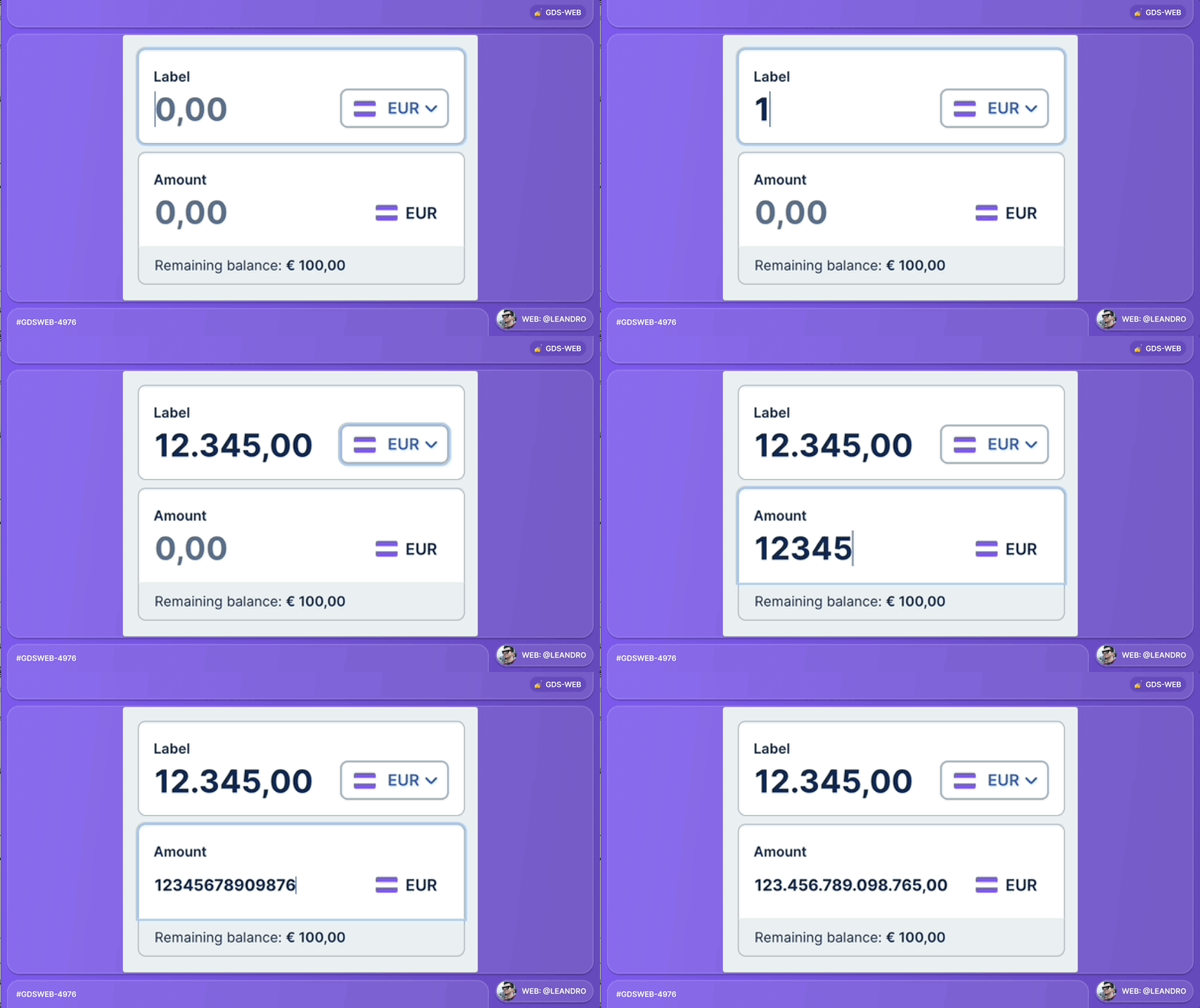
Take a look at this component in Playroom.
NewDate(Range)Input
Change year
With the property showYearNavigation the component gets two new buttons to change the calendar dropdown by an entire year. This is helpful in cases where the user needs to pick a date that is more than a year away from today’s date, but does not know the date by heart.
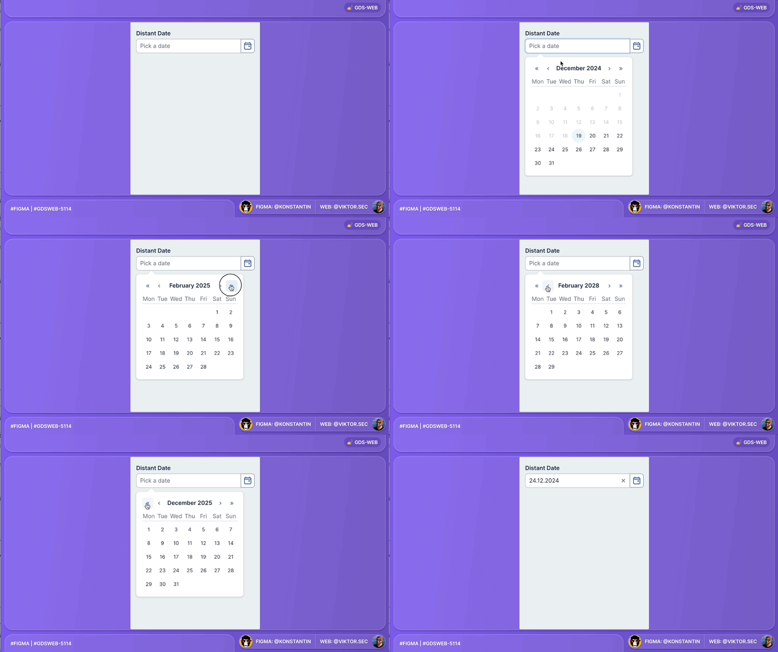
Take a look at this component in Playroom.
Enter memorable date
With the property memorable the calendar dropdown does not get rendered (and consequently the ButtonAddon is static). This setting is to be picked for entering memorable dates - such as a birth date that potentially is far in the past - by keyboard.
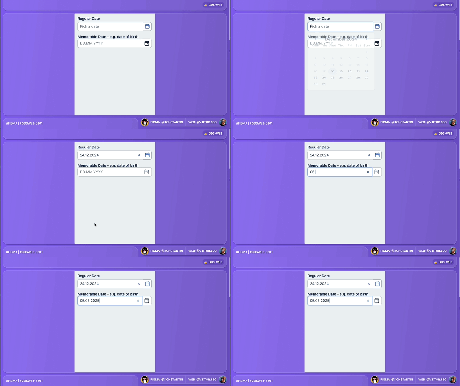
Take a look at this component in Playroom.
Dark mode improvements
Update to surface-inverted
The colour $color-surface-inverted () which is e.g. used in FixedFilter, FixedButton or Snackbar has now a new hex value in dark mode.
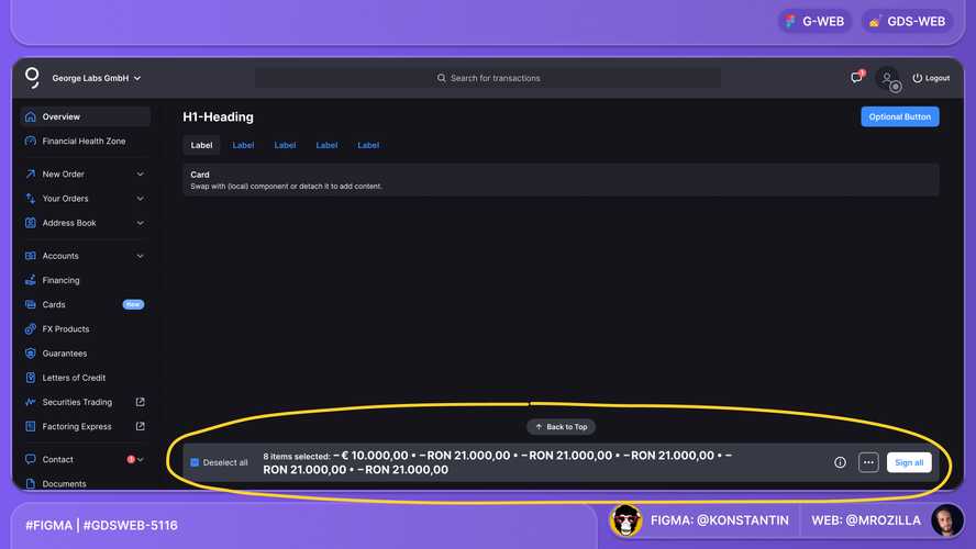
Take a look at FixedFilter in dark mode in Storybook.
New dark mode value for g-pro
The colour $color-g-pro (#022e67) which is used for the George Business and George Pro PrimaryNavigation has now a new hex value in dark mode.
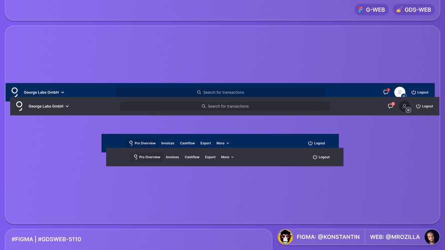
Take a look at the PrimaryNavigation of George Business in dark mode in Storybook.
New dark mode value for text-disabled
The colour $color-text-disabled () which is used e.g. in disabled InputFields has now a new hex value in dark mode.
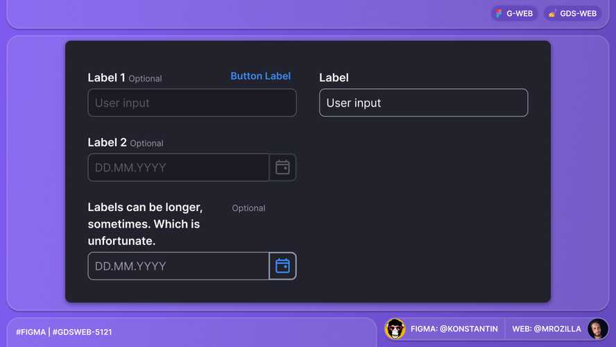
Take a look at the PrimaryNavigation of George Business in dark mode in Storybook.
Thank you to everyone involved for their outstanding work on the latest Design System releases!