Release highlights November
This blog post covers some highlights from the latest releases of GDS.
Button-Danger updates
We added two more variants to the Figma library
- Label + Icon
- Icon
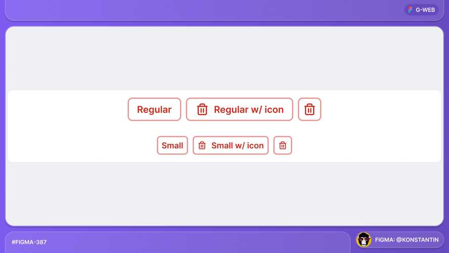
Learn more about this component and its use cases here.
ToggleBadge updates
ToggleBadge can be used as check boxes and radio buttons now.
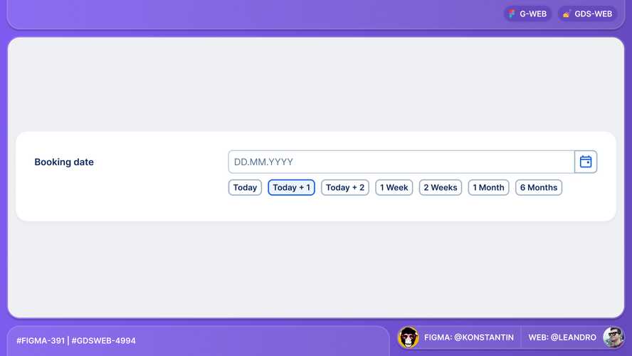
Learn more about this component and its use cases here.
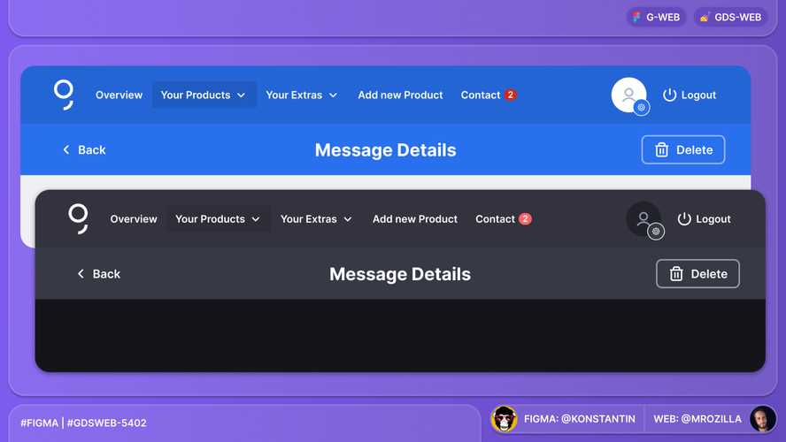
Dark mode update to blue-bright
The colour $color-blue-bright (#2870ed) which is e.g. used in the PrimaryNavigation in George Retail or in the StripeHeader, has now a new hex value in dark mode.
Separator.protrude
Separator got a protrude property which enables Separator in ModalBody to extend edge to edge.
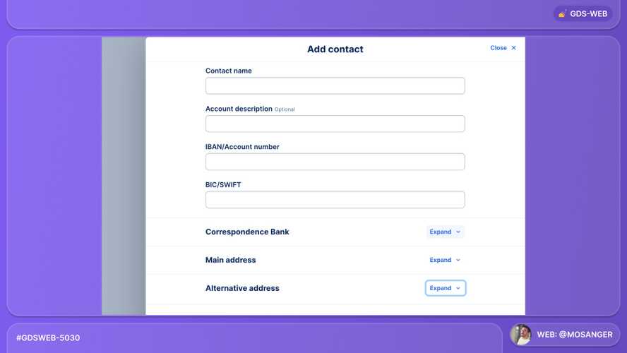
Take a look at this component in Playroom.
ModalDrawer depth
ModalDrawer got a depth property to distinguish layered DrawerModals.
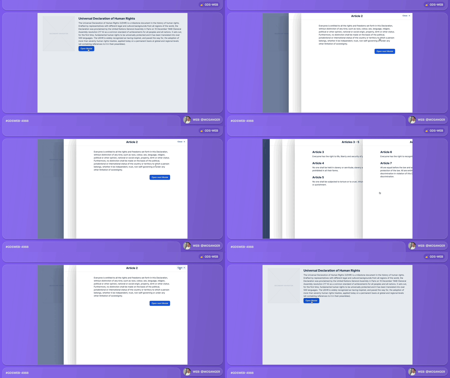
Learn more about this component and experiment with it in Playroom.
Thank you to everyone involved for their outstanding work on the latest Design System releases!